")


If your homepage makes people work for the info, they won’t. They’ll bounce back to Google faster than a client who “forgot their wallet.”
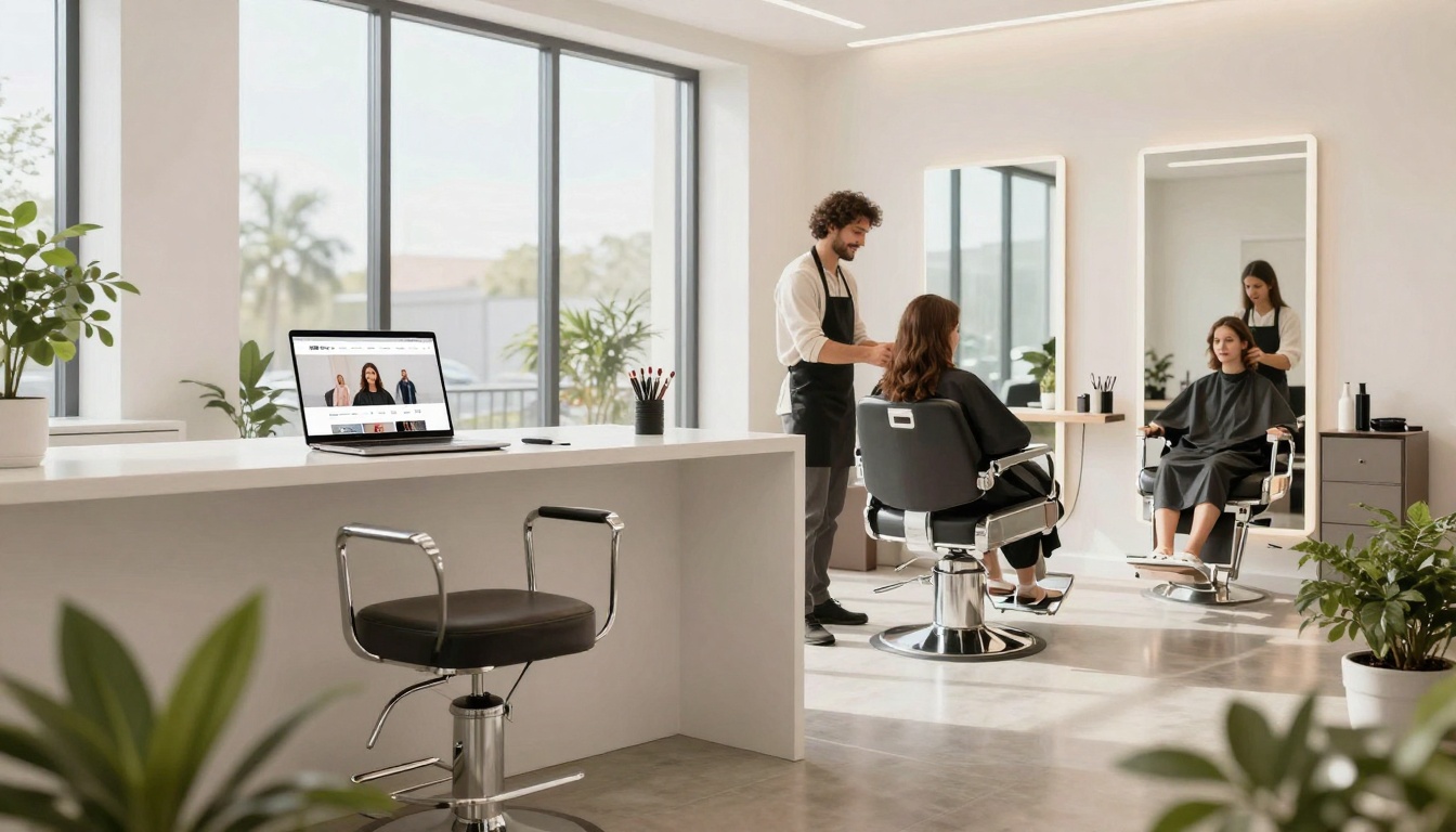
Your salon above the fold area (the beauty landing page, the digital front door for your hair salon website that people see before they scroll) has one job: help a stranger decide, in seconds, if you’re their person, then get them to book. This directly impacts conversion rates by turning visitors into clients. Not “learn more.” Not “vibe around.” Book.
And yes, this applies whether you’re a full salon, a suite renter, or a solo lash babe with a ring light and a dream.
What “above the fold” needs to do (in under 5 seconds)
Think of above the fold like your front desk, but online, where the initial user experience sets the tone. If someone walks in and nobody greets them, no signs, no menu, they’re like, “Cool, guess I’ll leave.” Same thing happens on your site.
Here’s what a member of your target audience is silently asking:
- “Are you in my area?”
- “Do you do what I need?”
- “Can I trust you with my face/hair/eyes?”
- “How do I book, like, right now?”
So your above-the-fold content needs clarity first, personality second. Personality is the glitter. Clarity is the glue. Without the glue, the glitter just ends up in someone’s car and they hate you.
If you want a bigger-picture view of what a hair salon website should include beyond the hero section, this Hair Salon Homepage Checklist is a solid reference point.
The salon above the fold ingredients (with swipeable copy)
Below is the “don’t overthink it” formula. You can customize the vibe, but don’t skip the basics.
- Clear headline (what you do + for who)
Skip the poetry. Your headline should be easy to understand at a glance.
Example: “Lived-in color and extensions in San Diego for busy women who want it done right.”
- Support line (your hook, without a TED Talk)
One short sentence that answers “why you?”
Example: “Low-maintenance blends, honest consults, and a plan you can actually follow.”
- Two call-to-action buttons, not seven
Primary call to action: Book Now booking button (always).
Secondary call to action: View service menu or See Pricing.
If you hide the booking button in a tiny menu, you’re basically playing hard to get with money.
- Social proof that isn’t cringey
Pick 2 to 4, max: “500+ five-star reviews,” “client testimonials,” “Extension-certified,” “Acne-safe products,” “Licensed in CA,” “As seen in…”
Real client testimonials are better than fancy.
- Location, contact information, and availability, right there
City, neighborhood (if relevant), and hours or “By appointment only.”
This cuts down on the “Wait, where are you?” messages.
- A strong image that matches the service
One hero photo or clean collage of high-quality images. Make it obvious what you do.
If you’re a lash artist, don’t lead with a photo of a plant.
- Navigation bar that doesn’t make people think
Keep it simple: Services, About, Gallery, Reviews, Contact.
Bonus: a sticky “Book Now” button on mobile.
Want inspo without falling into a Pinterest time warp? Skim a few of these hair salon website design examples and notice what the best ones have in common: clear offers, strong photos, and booking is always easy to find.
Above-the-fold examples for stylists, estheticians, and lash artists
Use these as plug-and-play layouts. The goal is simple: say the right thing, show the right thing, offer the next step with a clear call to action. These layouts improve the overall user experience.
Hair stylist or salon: “Show me you can give me the hair”
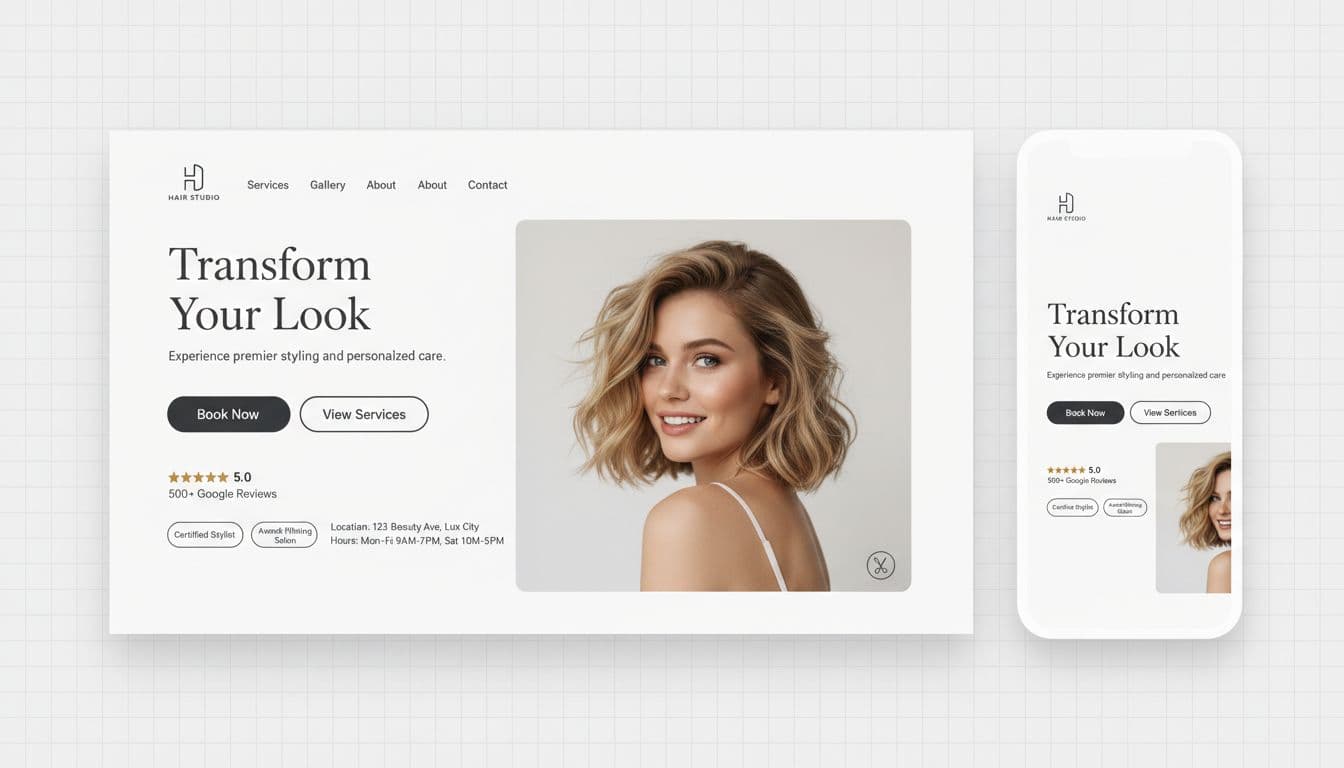
Headline idea: “Blonde, bronde, and lived-in color in Orange County.”
Support line: “Custom color, zero guesswork, and a grow-out that stays cute.”
Buttons: Book Now, View Services
Trust signals: “Extension-certified,” “500+ five-star reviews,” “New guest consults available”
Hero image: One strong after photo (great lighting), or a clean grid of 2 to 3 transformations.
Small but mighty add-on: a tiny line under the buttons like “New here? Start with a 15-minute consult using our online booking system.” It tells nervous clients exactly what to do.
Estheticians: “Tell me what you solve, not what you sell”
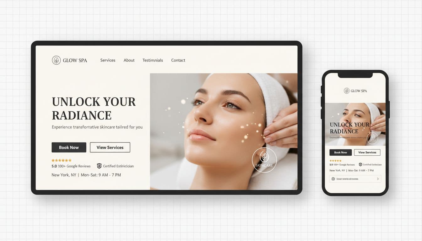
Headline idea: “Calm acne, smooth texture, and get your glow back.”
Support line: “Results-focused facials with a plan you can stick to.”
Buttons: Book Now, View Services
Trust signals: “Licensed esthetician,” “Sensitive-skin friendly,” “Client before-and-afters”
Hero image: A treatment moment (hands, towels, peaceful room), or a clean skin close-up that reflects your visual branding.
If you offer multiple services, don’t list them all up top. Pick the hero offer (acne, anti-aging, gentle facial) and let the Services page handle the rest.
Lash artist: “Make it easy to choose the right set”
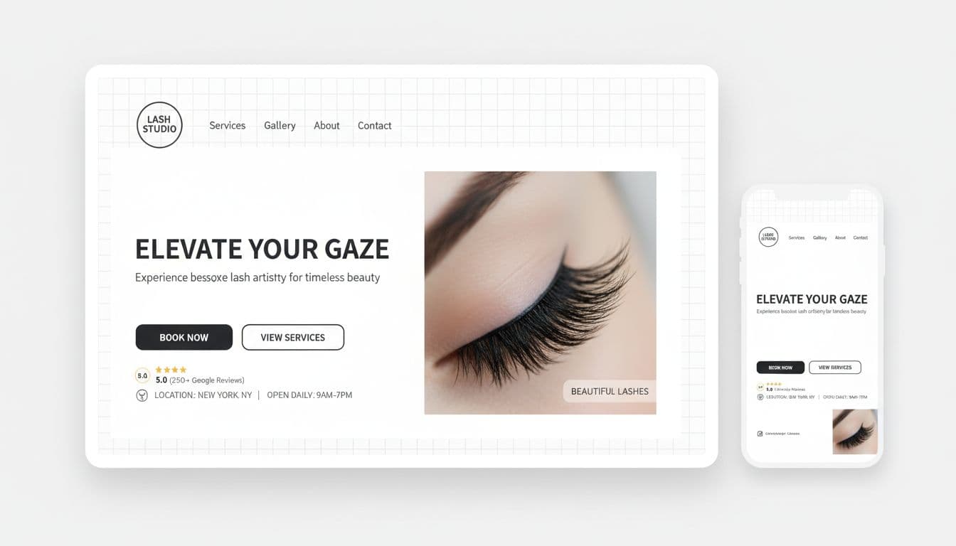
Headline idea: “Soft, fluffy lash sets in Austin.”
Support line: “Comfort-first application with retention that actually lasts.”
Buttons: Book Now, See Sets and Pricing
Trust signals: “Certified,” “Sanitation-first,” “Patch test available”
Hero image: A crisp lash close-up that matches your lash artist style (wispy, volume, classic).
Extra helpful: add a tiny “Not sure what to book?” link or line that points to a “Lash Menu” page for easy appointment scheduling. Confused people don’t book, they scroll, then they vanish.
If you’re trying to fill slow weeks, your above-the-fold section also needs to support promos without screaming “discount.”
Quick fixes that make your above-the-fold convert (and when Website in a Day makes sense)
If your salon above the fold isn’t getting clicks, it’s usually one of these:
- The headline is vague. “Welcome to our salon” tells nobody anything.
- Booking button is buried. If I need a treasure map to find the booking button, you’ve lost me.
- Your photo doesn’t match your price point. Luxury pricing with dark, grainy pics feels confusing and clashes with your color palette and brand identity.
- Too many options. Stylist profiles, lead capture forms, or social media integration create clutter; five buttons creates panic, not bookings.
- Poor mobile responsiveness. Most people are viewing on their phone between errands, and it looks like chaos.
A simple self-check: open your homepage on your phone, cover everything below the first screen, and ask, “Would a stranger know what to do next in this user-friendly layout?”
If the answer is “kinda,” that’s your sign. Digital marketing success starts here. This is exactly the kind of project that fits a done-for-you Website in a Day build on the Showit website builder, fast, focused, and built around booking (not just vibes).
Your homepage doesn’t need to be long. It needs to be clear. What would happen to your calendar if your site greeted people like your best front desk person does, with a prominent booking button?


Get a rock star website in 1 day!
One day. One dreamy website.
My Website in a Day service is perfect for beauty pros who need a polished, professional online presence—like, yesterday. We’ll take one of my custom-designed Showit templates and tailor it to your brand, style, and services in just one day. You’ll walk away with a site that books clients, builds trust, and looks like a million bucks (without taking forever to launch).


