")


Picking between a one page vs multi page website can feel weirdly high stakes. One wrong move and suddenly your site is giving “cute, but confusing,” which is not the vibe.
For beauty pros, the choice between a one page vs multi page website matters because it impacts search engine optimization for visibility and user experience for client trust. Your site has one job: guide the user journey to help people trust you fast, then book. A booking app can take an appointment, sure. But it can’t fully show your work, your style, or why you’re worth the price.
Let’s make this simple, because your website should not feel like a group project with bad communication.
Key Takeaways
- One-page websites rock for solo beauty pros with simple offers—like a hairstylist or lash artist—delivering fast loads, seamless scrolls, and quick trust-building to book without the clutter.
- Multi-page sites win for salons and teams, offering room for services, galleries, policies, and FAQs, plus better organization, scalability, and SEO to handle growth and complex client journeys.
- Hair salons usually need multi-page because clients crave details on specialties, pricing, and team before booking—cramming it all on one page feels like a CVS receipt, not premium.
- Pick based on your business stage: Simple and speedy? Go one-page. Depth, choices, or expansion plans? Multi-page aligns with your strategy for trust, clarity, and conversions.
- Both can look pro on Showit, but always prioritize mobile-friendliness, clear CTAs, and a user flow that guides clients straight to ‘book now’ without confusion.
What one-page and multi-page websites actually mean
A single-page website puts everything on one long scrolling page with linear navigation. Your services, about, reviews, and contact form all live together.
A multi-page website breaks those things into separate pages accessible via a navigation menu, like Home, About, Services, Gallery, and Contact. Same business, different layout.
Here’s the quick side-by-side:
| Website type | Best for | Main strength | Main drawback |
|---|---|---|---|
| Single-page website | Solo beauty pros with simple offers | Fast, focused, easy to launch, mobile-friendly | Can feel cramped as you grow |
| Multi-page website | Salons, teams, or service-heavy brands | More room, more clarity, better organization, mobile-friendly | Takes more planning |
If your business needs more than a quick intro and a booking link, a single-page website can get crowded fast.
Both options can look polished on the Showit website builder. The real question is how much your client needs to know before they feel ready to book.
When a one-page website makes sense for beauty pros
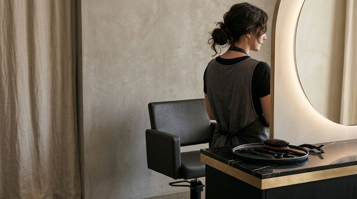
A one-page website works best when your business is simple and your offer is clear. Think solo hairstylist, brow artist, lash artist, or esthetician with one main audience and a short menu.
If most people only need a few answers, a single-page website can do the job well. They want to know what you do, see your work, check your vibe, and hit the call to action to book. Done. No scavenger hunt. No tiny menu tabs playing hide-and-seek. Like focused landing pages, this setup delivers fast page load time and responsive design, making it highly mobile-friendly for on-the-go clients.
This approach shines if you’re newer in business, rebranding, or replacing the classic “Instagram bio plus booking app” combo. Because let’s be honest, a booking app alone is helpful, but it is not a full brand presence. It books the appointment, but it doesn’t build much trust before the click.
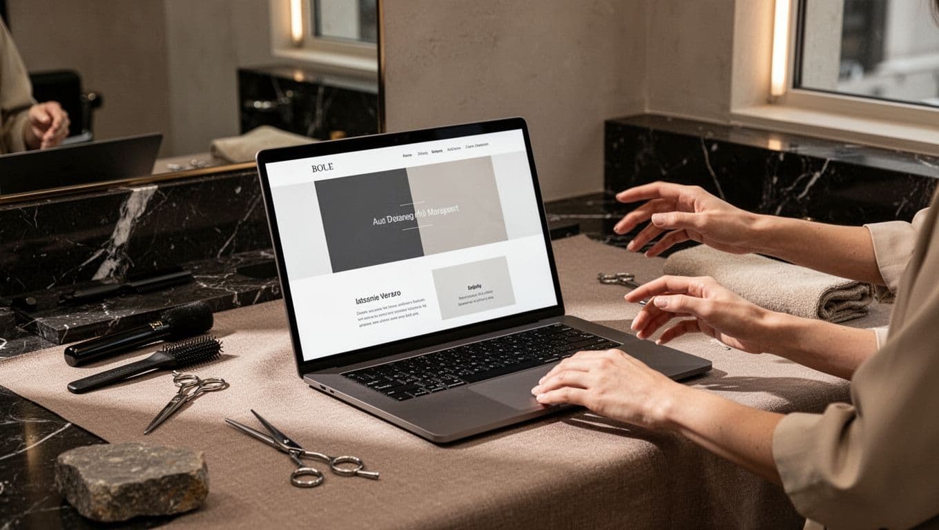
A single-page website can also be the smart choice if you want something polished fast. A done-for-you Website in a Day service using a website builder fits this kind of business well, especially when your goal is to stop DIY-ing and start looking legit. The seamless flow feels like a single-page application, ideal for storytelling that guides visitors effortlessly.
Still, a one-page website only works when you’re willing to keep it tight. If you start adding every service, every policy, every FAQ, every testimonial, and your life story from beauty school, it stops feeling clean. It starts feeling like a CVS receipt.
When a multi-page website is the better call
A multi-page website gives your brand room to breathe. That matters when you offer more than one thing, serve different types of clients, or need more trust built before someone books.
For example, hair salons often need space for service categories, team info, salon policies, location details, photos, and FAQs. Put all of that on one page and people start scrolling like they’re trying to find a lost earring in shag carpet.
Multiple pages also help visitors find what they need faster through the navigation menu. Someone ready to book can go straight to Services. A nervous new client can read About. A person checking your work can head to the portfolios. It boosts user experience, feels cleaner, calmer, and more premium.
This structure usually makes more sense if you want your site to grow with you, thanks to its scalability and smart information architecture. Add extensions later? Launch education? Hire a team? A multi-page website gives you space without turning your homepage into chaos. Internal linking across multiple pages keeps everything connected smoothly.
It also helps you create stronger first impressions in the spots that matter most. Your homepage needs to be clear right away, and these salon above-the-fold tips show exactly what should show up before anyone scrolls. Then, once people want details like pricing or team bios, the rest of your site can back it up.
What works best for hair salons, specifically
Hair salons usually lean multi-page, and there’s a simple reason. Most salons are not selling one easy thing. They’re selling outcomes, specialties, trust, and often a whole experience.
A solo stylist with one focus, like lived-in color and extensions, might do great with a one-page site at first. If your service menu is short and your brand is tight, it can absolutely work.
But once you have multiple artists, service levels, pricing questions, or high-ticket services like color correction, multiple pages usually win. Clients need space to understand what to book, who to book with, and what to expect. A clear structure with a solid navigation menu improves user experience, cuts bounce rate, and boosts conversion rates. If they feel confused, they leave. People don’t sit around decoding salon websites for fun.
That lines up with advice from this guide to salon website design, which points out that salon sites need to clearly explain services, brand, and booking in a way that feels easy for the client. Pretty matters, but clear always matters more. Multi-page sites also support search engine optimization by targeting more keywords, which drives organic traffic.
For salons, the contact page matters too. If your inquiry flow lacks a strong call to action or suffers from slow page load time, your site can look gorgeous and still lose bookings. This hair salon contact page guide is a solid example of how to keep that next step simple.
If you’re unsure what level of site fits your stage, look at your own business like a client would. Do they need one clear path, or do they need choices, proof, and context before saying yes?
Frequently Asked Questions
When should a beauty pro choose a one-page website?
A one-page site shines for solo pros with a tight service menu and one main audience, like brow artists or estheticians. It keeps things focused, mobile-friendly, and fast to launch—perfect if clients just need your vibe, work samples, and a booking button without digging. But keep it lean, or it turns into a scrolling nightmare.
Why do hair salons usually need a multi-page website?
Salons sell experiences with multiple services, team members, pricing tiers, and policies—clients need space to explore without overwhelm. Multi-page setups with clear nav menus boost UX, cut bounce rates, and support SEO for more organic traffic. It’s scalable for growth, unlike one-page sites that cramp up fast.
Can a one-page website hurt my SEO or bookings?
Not inherently—one-pagers can rank well with strong content and mobile speed, but they limit keyword targeting compared to multi-page depth. For bookings, they work if your offer is crystal clear and trust builds quick; otherwise, confusion kills conversions. Test your client journey: if they need more proof, go multi-page.
How do I decide between one-page and multi-page for my business?
Look at your offers: simple and solo? One-page for speed. Teams, specialties, or growth plans? Multi-page for clarity. Imagine your ideal client—do they need a quick vibe check or detailed navigation? Match the site to that, and pair it with tools like Showit for polish without the hassle.
Can I start with a one-page site and switch later?
Absolutely—many pros launch one-page for a fast glow-up, then scale to multi-page as they add services or team. Builders like Showit make transitions smooth without losing your brand flow. Just plan for it if growth is on the horizon to avoid redesign drama down the line.
The best choice is the one that matches your next season
If your business is simple, focused, and ready for a fast glow-up, a one-page site can be enough. If your salon has depth, multiple offers, or plans to grow, a multi-page site with a content management system (CMS) will serve you longer.
The goal isn’t to pick the fanciest option. It’s to pick the one that aligns with your digital marketing strategy, including search engine optimization, and makes your business easier to trust, easier to understand, and easier to book.
If your online presence still feels like “booking link and vibes,” it may be time for a site with more range, complete with a clean layout, portfolios, and backlinks for that final polish. You can browse beauty website portfolio examples or go straight for a fast done-for-you option with the Luxe Website Intensive. Whichever you choose, make responsive design a final checklist item.


Get a rock star website in 1 day!
One day. One dreamy website.
My Website in a Day service is perfect for beauty pros who need a polished, professional online presence—like, yesterday. We’ll take one of my custom-designed Showit templates and tailor it to your brand, style, and services in just one day. You’ll walk away with a site that books clients, builds trust, and looks like a million bucks (without taking forever to launch).


