")


If your hair salon website still feels like the kid sister of your Instagram and booking app, clients notice. They may love your reels, but if the site loads slow, looks dated, or makes booking weird, they’ll bounce faster than a bad bang decision.
In 2026, your site has one job: help the right person trust you and book. A booking app can take appointments, but it can’t show your standards, your brand identity, or your vibe, or why your salon is worth choosing. A modern site in 2026 might even include a video background to capture attention immediately. That’s why a salon website redesign matters more than ever.
Key Takeaways
- If your salon website loads slower than a root touch-up, isn’t mobile-friendly, or hides booking behind a scavenger hunt, clients bounce before they book—fix tech issues first for under 3-second mobile loads.
- Your site should scream the same luxury as your balayage and prices: ditch grainy photos, vague copy, and confusing service menus for clear, cohesive branding that builds instant trust.
- A polished website is your brand’s home base, not just an Instagram sidekick—seamless booking, stylist profiles, and social proof turn visitors into loyal clients without the friction.
- Embarrassed to share your link? That’s sign #9 it’s redesign time; templates like Showit can get you a high-end, stress-free site fast.
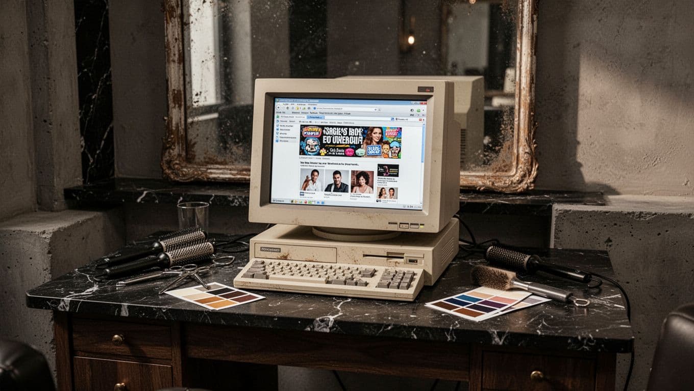
The tech is working against you
A redesign isn’t only about prettier fonts. Sometimes the real issue is that your hair salon website works like an old blow-dryer, loud, slow, and one minor inconvenience away from giving up.
1. It loads slower than a root touch-up
A slow site doesn’t feel high-end. It feels broken. If your homepage drags, people leave before they even see your work, your pricing range, or your booking button. Recent 2026 redesign warning signs keep pointing to the same problem, slow pages lose visitors fast and hurt your search engine optimization.
Current salon trend reports also suggest mobile pages should load in under three seconds. If yours doesn’t, the fix isn’t cosmetic. It’s about keeping people on the page long enough to care.
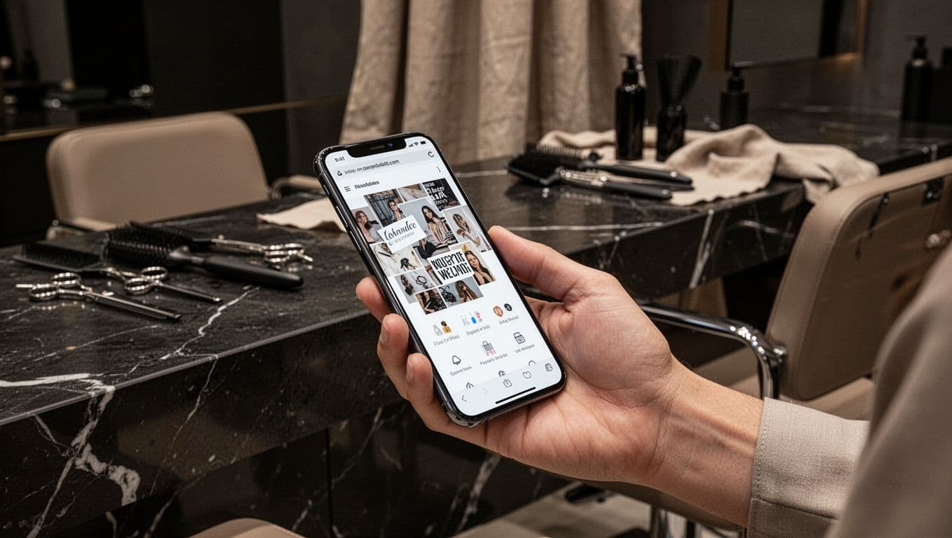
2. Mobile view makes people pinch, zoom, and give up
Most salon browsing happens on phones now. Recent 2026 roundups put mobile usage above 70 percent, which is why user experience advice for salon websites keeps pushing bigger buttons, simpler layouts, a mobile-first layout, and faster pages.
If text overlaps, photos crop weirdly, or your buttons are tiny little chic squares that hate thumbs, your site isn’t mobile-friendly. Clients won’t wrestle with it. They’ll go back to Google and book the next salon that looks easier.
3. The navigation feels like a scavenger hunt
People should find services, location, new guest info, and booking in seconds. If your menu has too many tabs, vague labels, or hidden call-to-action buttons, your site is asking visitors to do homework.
A great salon homepage should greet people like a solid front desk person does, fast and clear. These salon website hero section tips show what that should look like above the fold.
Your brand no longer matches your work
This is the sneaky one. Your work may be beautiful, but if the website looks off, your brand feels underrepresented before a client ever sits in your chair.
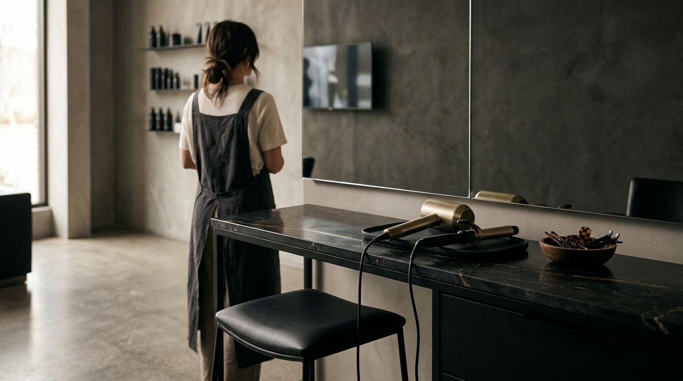
4. The website looks cheaper than your prices
Luxury pricing and bargain-bin visuals don’t belong together. Grainy photos, old fonts, cramped layouts, and random design choices send the wrong message, even if your balayage is flawless. Opt for professional photography and a cohesive color palette instead. Add a portfolio gallery featuring before-and-after photos to prove the quality of your work right away.
Your site should match the quality of your salon experience. When it doesn’t, people hesitate. They may not say it out loud, but they feel the mismatch right away.
5. Your copy is vague, generic, or says nothing fast
“Welcome to our salon” is not carrying the team. New visitors want the basics immediately, what you do, who you help, where you are, and how to book. If they have to scroll forever to figure that out, you’re losing them.
Your About page matters here too. It should sound warm, confident, and human, not like a robot in a blazer wrote it. Stylist profiles help create that essential human connection to build trust. These hair salon about page examples are a good reminder that clear story beats vague fluff every time.
A booking app takes the appointment. Your website should make the client feel good about choosing you.
6. Your hair salon website’s service menu creates confusion instead of bookings
When clients can’t tell the difference between your services, they freeze. Then they send the classic late-night DM, “Hey, what do I book?” because your service menu didn’t answer the question.
A clear service menu with transparent pricing helps people self-select fast, especially on mobile. If your offers are hard to scan, or your service names sound like secret code words, fix the structure with a better service page layout for salons.
The site isn’t helping people book
This is the part that affects revenue, stress, and how confident you feel sending people your link. A polished site should make your business easier to say yes to.
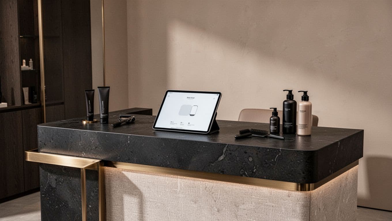
7. Booking feels harder than it should
If someone has to scroll, hunt, guess, and then jump into an online booking system that looks nothing like your brand, you’ve added friction. And friction kills momentum fast. Recent salon booking UX tips focus on fewer taps, clear pricing, and obvious next steps for a reason. A seamless booking widget integrated right into your hair salon website keeps the user experience smooth and on-brand.
Your booking path should feel easy on a coffee run, in the school pickup line, or at 11:30 pm when someone finally decides to book that gloss with your scheduling software.
8. You’re relying on Instagram or a booking app to do everything
Social media is great for attention. Scheduling software is great for taking appointments. Still, neither gives you the full brand presence a salon needs to look established online.
A real website builds trust with social proof like customer reviews, shows your specialties, answers key questions, and even includes an online shop. In other words, it gives your business a home base, not just a link in bio and a prayer.
9. You’re embarrassed to send people there
This is the loudest sign of all. If you avoid sharing your link, keep telling yourself you’ll fix it later, or know it doesn’t reflect your salon anymore, your gut already knows the answer.
Your website should make you feel proud, professional, and ready to be seen. It should help attract new clients, increase re-bookings, and improve your conversion rate, not make you cringe and mumble, “Ignore that page, I’m still working on it.”
If three or more of these signs hit a little too close to home, a salon website redesign isn’t extra, it’s overdue. Your hair salon website should feel polished, aligned, and easy to trust, because that’s what turns casual visitors into real inquiries.
And if DIY sounds like its own personal nightmare, fair. Website templates like Showit, especially with a boutique-style layout that utilizes white space for a high-end feel, can get you live fast without the stress spiral as part of your digital marketing strategy.
Frequently Asked Questions
1. How slow is too slow for a salon website load time?
Aim for under three seconds on mobile, per 2026 trends—anything draggy feels broken and kills SEO. Slow pages lose visitors before they see your portfolio or pricing, so optimize images and simplify code to keep high-end momentum.
2. Why does mobile-friendliness matter more for salons now?
Over 70% of salon browsing is on phones, so tiny buttons, overlapping text, or weird crops make clients pinch-zoom and quit. Go mobile-first with big taps, clean layouts, and fast pages to match how people book on the go.
3. What’s wrong with a vague or generic website copy?
New clients need the basics fast: what you do, who for, where, and how to book—’welcome’ fluff won’t cut it. Warm, confident copy plus stylist profiles and clear About pages build human trust, beating robotic vibes every time.
4. How can I make booking less frustrating on my site?
Embed a seamless, on-brand booking widget with clear pricing and fewer taps—no scrolling hunts or style mismatches. It keeps momentum from homepage to confirmation, even at 11:30 pm, boosting conversions without app dependency.
5. Do I still need a full website with Instagram and booking apps?
Social grabs attention and apps take slots, but only a site shows your full vibe, reviews, services, and shop for real trust. It’s your established home base that turns links into inquiries, not just bio traffic.


Get a rock star website in 1 day!
One day. One dreamy website.
My Website in a Day service is perfect for beauty pros who need a polished, professional online presence—like, yesterday. We’ll take one of my custom-designed Showit templates and tailor it to your brand, style, and services in just one day. You’ll walk away with a site that books clients, builds trust, and looks like a million bucks (without taking forever to launch).


