
")


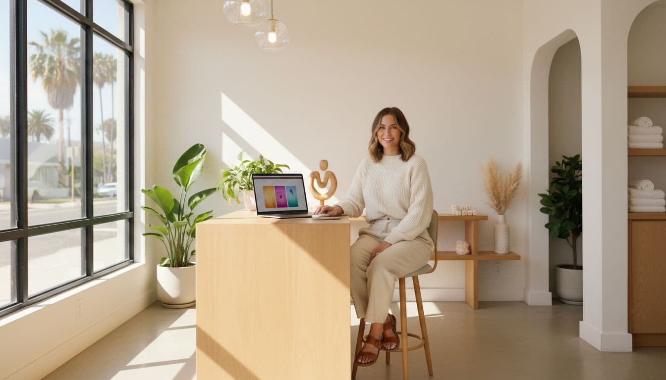
If your hair salon website feels “pretty” but your calendar still has random Tuesday holes, it’s usually not your photos. It’s your salon website copy.
Words do the job your best front desk person does, greet, guide, and get the booking. The problem is most salons write pages like a diary, not like a client journey that enhances user experience. Then visitors bounce and hurt your conversion rate, because they’re confused, overwhelmed, or forced to play detective.
Below is a page-by-page copy map you can follow in order, so your site answers the right questions at the right time, and stops the “hey girl, how much for highlights?” messages before they start.
The copy map: every salon website page, in order
Think of your site like a salon visit. There’s a flow, especially with responsive design and mobile optimization keeping everything smooth on any device. Nobody wants to walk in and get handed a 12-page policies speech before they’ve even sat down.
Here’s the page order that matches how clients decide.
| Page (in order) | What it needs to do | Copy must-haves |
|---|---|---|
| Home | Confirm “I’m in the right place” fast | Clear headline, location, 1 main call-to-action button, top services |
| About | Build trust without a life novel | What you’re known for, your vibe, stylist profiles, proof, next step |
| Services | Help them pick the right thing | Simple service menu categories, who it’s for, what’s included |
| Pricing | Reduce DMs and price shock | Starting prices, ranges, what affects total |
| Before-and-After Gallery/Portfolio | Prove you can do the look | Curated results, labels by service type |
| Reviews | Lower the “new stylist fear” | 6 to 12 strong customer testimonials, short and specific |
| Start Here (New Clients) | Make booking feel safe | How it works, what to book first, expectations |
| Booking | Get them scheduled, not stuck | What to choose, timing, deposits, link or embed |
| FAQ/Policies | Protect your peace | Late, cancel, redo, kids, refunds, communication |
| Contact | Catch edge cases | Contact information with two options max (book or message), response time |
| Location/Hours | Kill the “where are you?” texts | Address, parking, hours, map, nearby landmarks |
| Blog (optional) | Bring in search traffic | Helpful posts for local SEO, local keywords, internal links |
Copy rule you can live by: Clarity first, personality second. Glitter is fun, but glue is required.
Now let’s talk about what to write on the pages that matter most.
Home + About page copy: your online vibe check
Your homepage isn’t a mood board. It’s a decision page. In the first few seconds, a stranger is asking: “Do they do what I want, near me, at a price that won’t ruin my week?”
For your Home hero section, keep it simple with a striking hero image:
- A headline that says service + location (example: “Lived-in color and extensions in Santa Barbara”).
- One support line that sounds like a human (example: “Low-stress appointments and hair that grows out cute.”).
- One main call-to-action button (Book Now), and one backup call-to-action (View Services).
If you want a tighter formula for that top section, use this Salon Above the Fold Guide. It’s basically the “don’t make people scroll for basics” pep talk.
Then your about page takes over. Skip the corporate voice that ignores your brand identity. Share your brand story instead. Nobody’s impressed by “we pride ourselves.” They want to feel safe in your chair.
A strong about page includes: what you specialize in, what the appointment feels like, proof (certs, results, reviews), and a clear next step. For a plug-and-play structure that still sounds like you, grab these Hair Salon About Page Examples.
Need inspo for how hair salon websites lay this out visually? Skim a few salon website examples and notice what’s consistent: clear offers, easy booking, and strong photos that match the price point.
Services + pricing page copy that stops the DMs
Your services page on your beauty salon website should feel like a great consult. Not rushed, not confusing, and definitely not a 40-item service menu that reads like a Cheesecake Factory menu.
Start with 3 to 6 service categories, max. Under each category, give clients enough info to choose without messaging you at 10:47 pm.
For each core service, include:
- Who it’s for (example: “For brunettes who want dimension without high upkeep.”)
- What’s included (in plain words, not mystery)
- How long it takes (ranges are fine)
- Maintenance level (low, medium, high, be honest)
- Starting price or range (yes, you can say “starting at” and still keep boundaries)
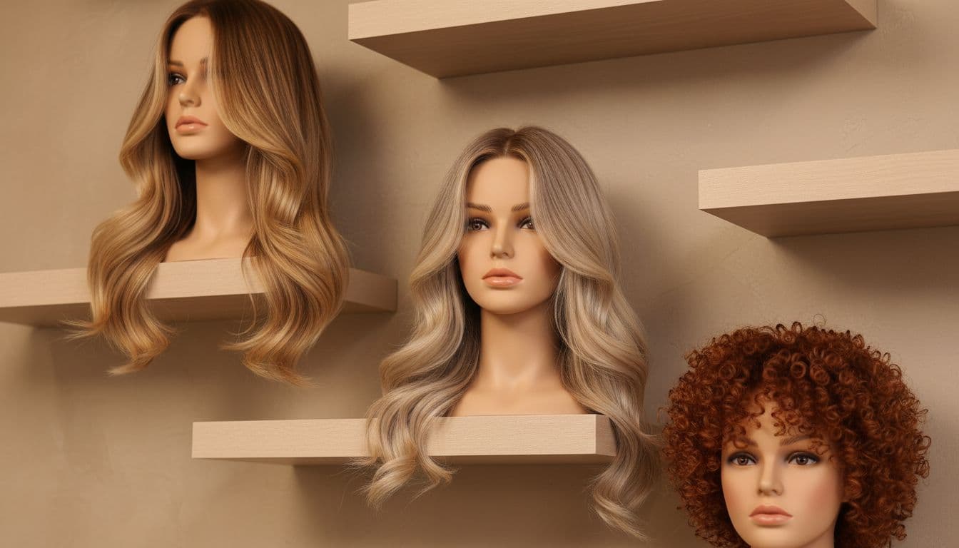
Enhance your service menu with high-quality visual content that showcases your work in an aspirational way, like this image of styled mannequin heads.
Pricing is where salons get weird. Either it’s hidden (hello, trust issues), or it’s a bare list with zero context (hello, “why is balayage $300?”). The sweet spot is transparent pricing with guardrails.
Not sure what to show? This guide to salon website pricing covers when exact prices, ranges, or custom quotes work best.
If you want a deeper breakdown and swipeable prompts, this guide on hair salon pricing page copy lays out what to say, and what to stop saying. It also helps you filter bargain hunters without sounding like a snob.
On the money side, it helps to revisit how you build prices and packages. Booksy’s overview of hair salon pricing strategies is a solid reference when you’re deciding what belongs in a “signature” service versus an add-on.
Gallery, booking, and contact copy that does the front desk job
Your before-and-after gallery should be curated, not chaotic, with professional photography that provides social proof of your best results. Choose 20 to 40 standout examples. Group them by category (blondes, brunettes, extensions, curly). Otherwise, your dream client scrolls right past because she can’t find “her” hair.

Photo by Asad Photo Maldives
Next comes the New Client (Start Here) page. This page saves time, because it answers the questions you’re tired of answering:
- What to book first
- Deposits and how they work
- What to bring (inspo pics, hair history)
- What happens if they’re late (say it nicely, but say it)
Then, make online booking and appointment scheduling stupid easy. On your booking page, tell them what to choose and highlight real-time availability. People don’t avoid booking because they hate you. They avoid booking because they’re scared of picking wrong.
Finally, your contact page shouldn’t feel like a DMV form with better lighting. Give two paths: book now, or send a message. Add your response-time promise, and move on. If you want the exact layout and wording, follow this Salon Contact Page Guide.
If all of this feels like a lot, that’s because it is. That’s also why my done-for-you Website in a Day Service exists. It’s for beauty pros who want a polished, mobile-friendly Showit website builder site fast (and yes, Summer 2026 availability is limited). Prefer DIY with a head start? Browse the high-end Showit website builder templates shop and pick a vibe that matches your pricing.
Conclusion
Great salon websites don’t talk at people, they guide them. When your salon website copy follows the right page order, clients feel confident, pricing makes sense, and booking feels easy. This approach boosts search engine optimization, enhances salon marketing efforts, and drives long-term growth. Consider adding digital gift cards to your site for a quick revenue boost. Pick one page this week (Home, Services, or Pricing) and rewrite it using the map above. Your future self, and your inbox, will thank you.


Get a rock star website in 1 day!
One day. One dreamy website.
My Website in a Day service is perfect for beauty pros who need a polished, professional online presence—like, yesterday. We’ll take one of my custom-designed Showit templates and tailor it to your brand, style, and services in just one day. You’ll walk away with a site that books clients, builds trust, and looks like a million bucks (without taking forever to launch).


