")
")


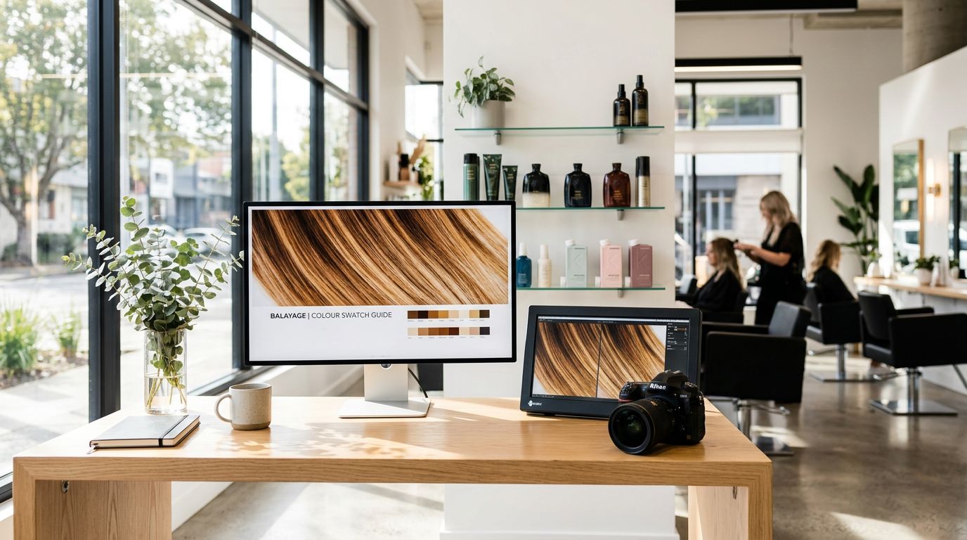
Ever upload a gorgeous salon photo, only to see it turn into a crunchy, pixel-y mess on your site? Love that for us. Nothing says “premium user experience” like a blurry balayage photo that looks like it was taken on a flip phone in 2009.
The fix isn’t “take better photos” (although, yes, natural lighting helps). Most of the time, it’s salon website image sizes and file prep. In other words, your website is stretching, squeezing, or choking on images that are either too small, too huge, or saved weird, even when you start with high-resolution photos.
This guide gives you practical sizes that look sharp, load fast, and still feel high-end on Showit (because same).
What “crisp” actually means (and why salons get burned)
“Crisp” is really two things working together:
First, your images need enough image resolution to look sharp on modern screens (including retina displays) with high screen resolution. If you upload something tiny, then scale it up in your design, it’ll blur. It’s like trying to make a bob longer by pulling it. That’s not how this works.
Second, your images must contribute to good page load time. A site that takes forever to load makes people bounce, even if your work is unreal. Mobile visitors are especially impatient without proper mobile optimization, and your future client is probably scrolling while waiting in a Target line.
Here’s what usually causes the blur spiral:
- You saved images straight from Instagram (they’re compressed and often too small).
- You uploaded camera originals (8 to 20 MB each), then your site loads like it’s on dial-up.
- You stretched an image bigger than its actual pixel size in Showit.
- You exported in the wrong format (like a PNG format for a full-screen photo or a JPEG format with too much compression).
If your photo looks blurry on your website, it’s almost always “too small, then stretched,” or “too big, then smashed by compression.”
One more thing, Showit designs are visual. That’s the whole point. So images aren’t “extra,” they are the vibe. Properly preparing them also boosts search engine optimization through effective alt text and faster performance.
Salon website image sizes: a simple cheat sheet that stays sharp
Before the table, one rule makes almost every decision easier for responsive design: Design at the size you want it to display (your target image dimensions), then upload images about 2x that size for extra clarity (especially for desktops and retina screens). After that, compress so your pages still load fast.
Use this as your starting point for most salon sites in 2026.
| Where the image goes | Recommended pixel width to upload | Best aspect ratio | Suggested max file size | Best file type |
|---|---|---|---|---|
| Full-width hero banner (homepage top) | 2400 x 1400 | 16:9-ish | 300 to 450 KB | JPG |
| Section background photo | 2400 x 1600 | Varies | 300 to 450 KB | JPG |
| Gallery or portfolio (landscape) | 2000 to 2400 px wide | 3:2 or 4:3 | 250 to 400 KB | JPG |
| Gallery or portfolio (portrait) | 1200 x 1800 | 2:3 | 250 to 400 KB | JPG |
| Team headshots | 1200 x 1500 | 4:5 | 200 to 300 KB | JPG |
| Small detail images (icons, badges) | 500 x 500 | 1:1 | 50 to 150 KB | PNG or SVG |
| Blog featured image | 1600 to 2000 px wide | 16:9 or 3:2 | 200 to 350 KB | JPG |
Note: JPEG format works best across the board for photos (WebP format is a modern alternative for speed). If custom photos are not available, stock images serve as a solid fallback, but they must still meet these specs.
Takeaway: most salons don’t need 5000 px wide images. They need consistent crops, enough pixels for sharpness, and smaller file sizes for speed.
If you want a general web-wide reference point, Shopify keeps an updated, practical breakdown in Shopify’s 2026 image size guidelines.
Also, your images will look more expensive when your crops match. A clean grid beats chaotic collage energy every time.
Showit image prep that keeps quality (without tanking load speed)
Showit makes design flexible, which is why we love it. Still, flexibility can turn into “why is this background photo fuzzy on desktop” in about six seconds.
Here’s what works well for Showit sites right now:
Export at the right size first, then compress for compressed images
Don’t upload camera originals and hope for the best. Resize first (to the pixel ranges above), then compress.
A good goal for most salon sites:
- Keep file size under 400 KB per image, and closer to 250 to 300 KB when you can
- 72 PPI is totally fine for web
- Color profile: sRGB (it prevents weird color shifts)
Compression matters because your homepage often has 10 to 25 images. Those add up fast.
If you want a second sizing reference (especially for blog images), this is a helpful read: best image sizes for blogs in 2026.
Pick the right “fit” so Showit doesn’t do something unhinged
In Showit, image settings like Fill, Crop, or Contain change how your photo displays. If your hero image looks stretched, it’s usually the wrong fit mode, not a “bad image.”
Quick guidance:
- Contain keeps the whole photo visible (no cropping).
- Fill/Crop covers the space (better for backgrounds), but it will crop edges.
- Stretch is the “last resort,” like box dye at 1:00 a.m.
For high-impact sections, consider a background video as an alternative, but it needs even stricter optimization to avoid slowing page speed.
Optimize logo size and favicon size for strong branding
- Aim for logo size around 300 to 500 pixels wide (keep file size tiny, under 50 KB).
- Use favicon size of 32×32 pixels (PNG format works best for crisp display across devices).
Keep text off important photo details
If your hero image has hair detail, don’t park a headline right on the blend. You’ll end up dimming the photo with an overlay, and then you’re wondering why everything looks dull.
Instead, choose images with negative space, or crop with room for text.
If you want your homepage to book more (not just look cute), pair crisp images with strong structure. A fast way to get there is a done-for-you intensive like Showit Website in a Day Intensive, because you get strategy and design without a three-month saga.
Keep images booking-focused, not just pretty
Salon photos can do more than show off your work. They can reduce “how much is this?” DMs, get better-fit inquiries, and push people toward your online booking system.
A few ways to use crisp images more intentionally:
Use fewer, stronger photos. Ten amazing photos beat 40 random ones. Your site should feel like a curated portfolio gallery, not your camera roll after a double-booked Saturday.
Match images to the section goal. For example, put your best before and after photos near your signature service. Place a warm, friendly team photo near your new guest info. Keep the salon interior shot near location and parking details.
Format service visuals consistently. If your services page has mismatched crops, it reads messy, even if your work is flawless. Clean formatting makes your pricing feel more premium too, because people trust what feels organized. If you’re rebuilding your menu layout, this pairs well with Organize Salon Services Online, especially if your current menu feels like a scrolling endurance test.
Finally, don’t forget your website templates option. If you want a polished Showit site fast, but still want to DIY updates later, start with a layout that already respects spacing and image ratios. That’s the difference between “pretty” and “pretty and professional.” You can browse High-End Showit Templates for Salons and plug in properly sized photos from the start.
Conclusion
Blurry photos aren’t a personality trait, they’re a prep problem. With professional photography as the foundation for these tips, when you nail salon website image sizes, keep crops consistent, and compress your files, your site stays sharp and loads fast. That combo makes your work look more premium, because it is.
Your photos already sell the appointment. They just need to show up looking like themselves. Proper image prep like this also boosts search engine optimization and professional brand perception.


Get a rock star website in 1 day!
One day. One dreamy website.
My Website in a Day service is perfect for beauty pros who need a polished, professional online presence—like, yesterday. We’ll take one of my custom-designed Showit templates and tailor it to your brand, style, and services in just one day. You’ll walk away with a site that books clients, builds trust, and looks like a million bucks (without taking forever to launch).
")


