")


Your brand doesn’t need a full-blown identity crisis. It needs a quick rinse, a little toner, and a trim that makes everything look intentional again.
A brand facelift checklist, a form of mini branding, is basically the “clean girl bun” of design. Simple, neat, and it magically makes your whole vibe look more expensive. If you’re a salon owner (or any beauty pro), this matters because your website is doing the talking when you’re busy doing… literal hair.
Let’s tighten up your colors, fonts, and wordmark so your brand message is clear and your professional branding looks polished, without turning this into a three-month project that dies in a Google Drive folder.
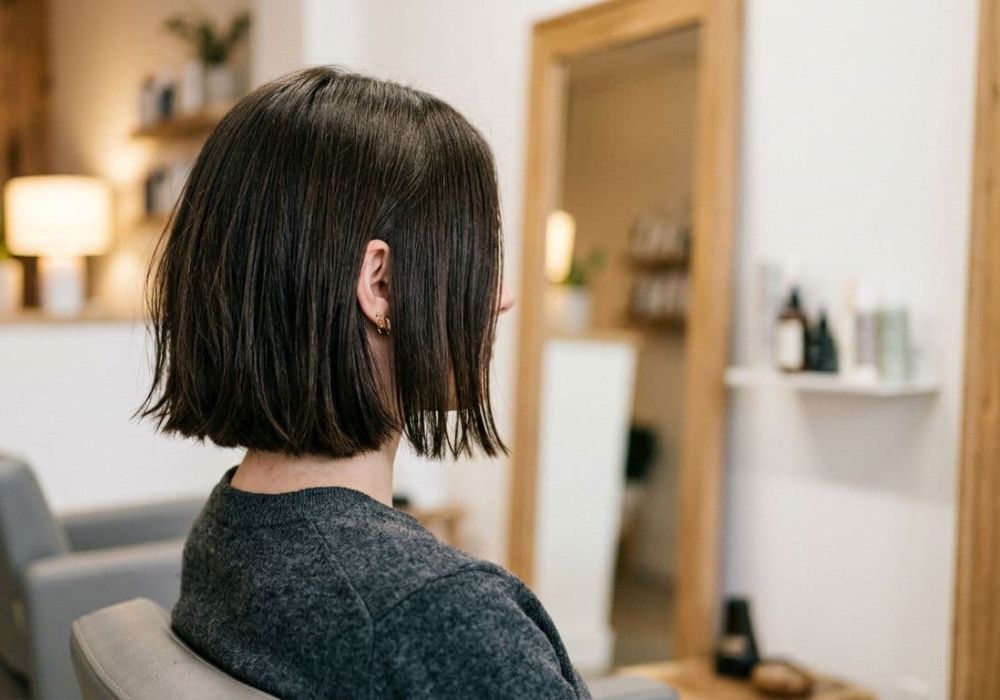
Start with a checklist overview for your brand’s evolution (so you don’t spiral)
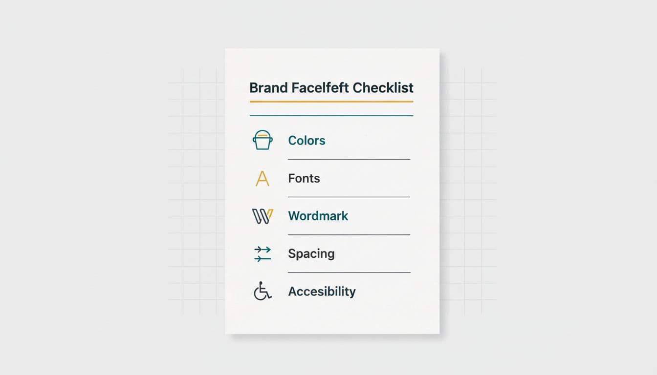
An at-a-glance brand facelift checklist layout, created with AI.
A mini facelift works best when you’re not trying to “fix everything.” You’re just removing the stuff that makes your brand feel a little… 2017 Etsy logo era. Use a branding questionnaire to help identify these needs.
Here’s the tight version of what to check before you touch your website or Instagram graphics:
- Colors: One primary, a couple supporting, one accent, and neutrals that don’t fight each other.
- Brand fonts: Two font families max (three only if you know what you’re doing and you’re not using all caps everywhere).
- Simple wordmark: A clean text logo that looks good small, looks good big, and doesn’t turn into a blurry blob on your phone.
- Spacing rules: Consistent margins and padding for consistent branding, so your brand stops looking like it’s wearing clothes from five different fashion closets.
- Accessibility basics: If someone can’t read your text, they can’t book you. Period.
Keep this mini audit focused on where your brand actually shows up: your Showit site, your booking link, your Instagram bio, your service menu, and your “new client” highlights. If those spots look consistent, you’ll feel instantly more legit.
And here’s the part people skip: write down the final choices in one place. A single-page “brand guide sheet” as part of this mini brands series beats 42 screenshots saved to your camera roll named “FINALfinal2.”
Choose brand colors that photograph well and read clearly online
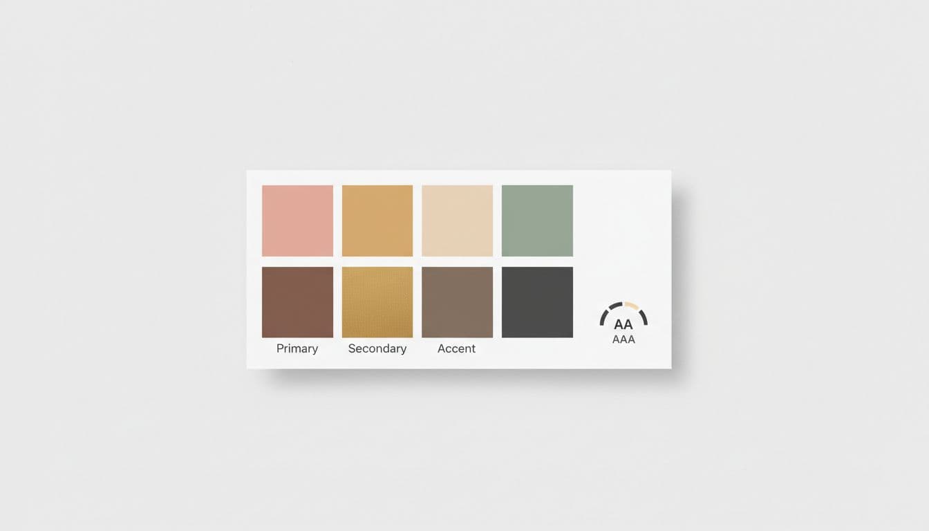
A simple palette board with color roles and contrast reminders, created with AI.
Salon brands have a special challenge: your work is already colorful. Hair photos, skin tones, product shelves, neon salon signs, that one wall you painted “millennial pink” in 2019, it’s a lot.
Build a color palette of supporting tones that align with your ideal client and photography style, so your colors support your images, not compete with them. If your feed is full of warm blondes, coppers, and bronzy balayage, super-cool gray and icy blue can feel off. If your style is crisp and modern, muddy beige everything can make your brand feel tired.
The fix is less “find your signature color” and more “pick roles and stick to them.” Here’s a simple way to assign jobs to your palette:
| Color role | What it does | Where it shows up |
|---|---|---|
| Primary | Sets the tone | Buttons, links, key headings |
| Secondary | Adds personality | Sections, callouts, icons |
| Accent | Creates pop | Badges, hover states, small highlights |
| Light neutral | Creates breathing room | Backgrounds, cards |
| Dark neutral | Keeps text readable | Body text, footer text |
Documenting the specific hex color codes is essential for maintaining a high-quality visual aesthetic. Finding the perfect unique accent is like finding an ultra rare collectible for your brand.
Two extra rules that save you from design regret:
- Choose a dark neutral you’ll actually use for text. “Soft taupe” looks cute until it’s paragraph text and suddenly nobody can read anything.
- Check contrast before you commit. If your button text disappears, it’s not “minimal,” it’s just frustrating. The goal is to create a cohesive nature within your brand package.
If you want a quick reference on what makes a salon logo and brand feel clear and recognizable, DaySmart’s salon logo tips are a helpful reminder that simple usually wins, especially when your brand has to work on tiny screens.
Pick brand fonts that feel like your service level (and make a clean wordmark)
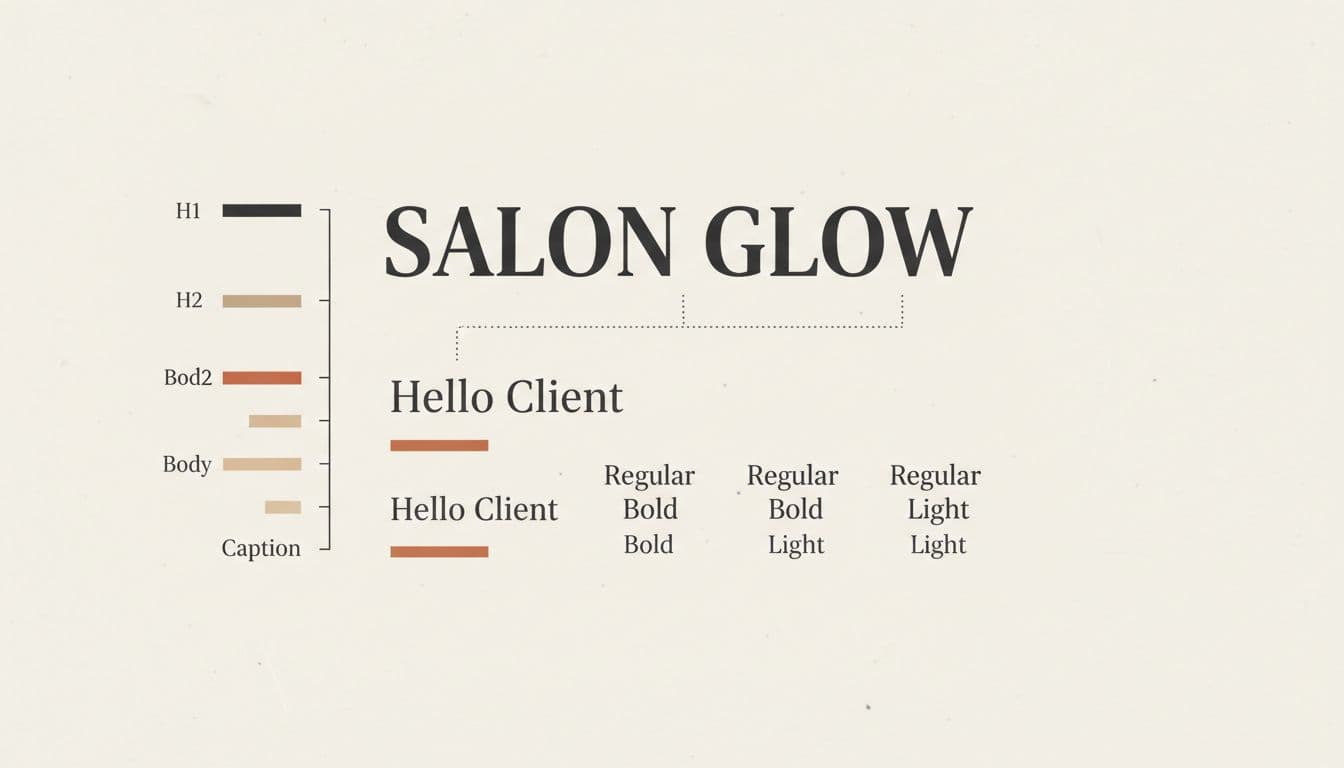
A typography pairing card showing clear hierarchy, created with AI.
Fonts do more emotional work than people think. They’re basically your brand’s tone of voice, but visual. You can be the most talented stylist in town, but if your website is in a swirly script that looks like a wedding invitation from 2004, your vibe will feel off.
A simple pairing formula that works for beauty brands: finding the perfect professional match for your salon’s level with brand fonts.
- A headline font with personality (often a serif or a modern display font).
- A body font that’s clean and easy (usually a sans-serif).
Then assemble frames for a clear hierarchy and stop winging it. If everything is the same size, nothing looks important. If everything is bold, nothing looks bold.
A realistic hierarchy for a salon website:
- H1: Big, confident, not a paragraph
- H2: Clear section headings
- Body: Calm, readable, slightly roomy line spacing
- Captions: Smaller, still readable, not light gray on white (please)
If you want more examples of what looks current in the beauty space, this guide to modern beauty salon logos and fonts is solid for visual reference. Use it like a Pinterest board, not like a rulebook.
A simple wordmark that looks expensive (without trying too hard)
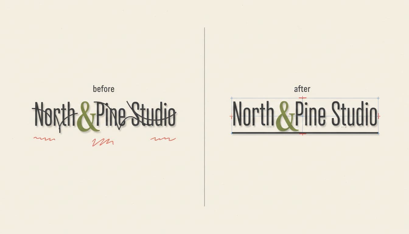
A before-and-after wordmark polish mockup, created with AI.
When exploring logo design options, a wordmark is just your business name in type, but done on purpose. For salons, it’s often the best choice because it’s readable, flexible, and doesn’t lock you into scissors icons forever. A simple wordmark shines here.
To make a wordmark look polished, focus on the unsexy details people feel but don’t notice:
- Kerning (letter spacing): If letters are kissing in weird spots, it screams “I typed this in Canva and called it a day.”
- Weight: Super-thin fonts can disappear on phones. If you’re going for luxury, you want “crisp,” not “barely there.”
- Clear space: Give your wordmark breathing room. If it’s glued to the edge of your header, it feels cheap fast.
- One strong version: Have a primary logo and a secondary logo (like a simple stacked version) for different screen sizes. Don’t create seven “logo variations” that all fight each other.
Also, test it where it actually has to live: your website header, your favicon, your Instagram profile circle or gallery wall, your booking page, even a canvas print. If it fails in one of those spots, it’s not ready. This is exactly why a mini brand facelift pairs so well with a fast website build, turning your simple wordmark into one of those mini brands masterpieces. When you’re doing something like Website In A Day on Showit, you don’t have time to debate fonts for two weeks. You make a few smart choices, apply them everywhere, and your brand instantly looks more put together.
Conclusion: a simplified rebranding process beats a full rebrand you never finish
A good brand facelift checklist powers this mini branding approach without asking you to reinvent your business. It guides you to pick colors that work online, fonts that match your price point, and a wordmark that looks clean in real life. Small changes deliver your finalized brand assets as a collector’s guide to your business’s new look, with big differences.
Part of our successful mini brands series of growth steps, this mini branding fixes brands that feel a little “random.” Treat it like a toy clearance to ditch old, childish design habits for a more sophisticated vibe. It’s a fixable design problem. Tighten the basics, then let your work be the star. Polished always books better.


Get a rock star website in 1 day!
One day. One dreamy website.
My Website in a Day service is perfect for beauty pros who need a polished, professional online presence—like, yesterday. We’ll take one of my custom-designed Showit templates and tailor it to your brand, style, and services in just one day. You’ll walk away with a site that books clients, builds trust, and looks like a million bucks (without taking forever to launch).


