")


If people visit your website and then vanish, your site has a job problem.
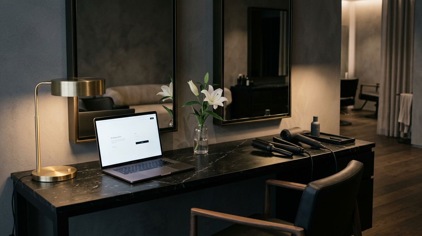
A pretty website is simply not enough. For beauty and wellness brands, a site must build trust, answer questions, and make the booking process feel seamless. If you are relying solely on Instagram or a third party booking app to do the heavy lifting, that is usually where potential clients start slipping out the side door.
Implementing a solid conversion rate optimization strategy is the best way to turn casual visitors into loyal clients. A high performing website should act as a powerful engine for your lead generation, rather than serving as a static digital brochure.
The good news is that your website does not need more fluff. It needs more clarity.
Key Takeaways
- Prioritize clarity over complexity: Visitors should immediately understand what you offer and what they need to do next; if they have to guess, they will leave.
- Simplify your service menu: Remove friction by categorizing offerings logically, using plain language, and including clear pricing to help clients book with confidence.
- Optimize for the mobile experience: Since most traffic comes from mobile devices, ensure your site loads quickly, buttons are easy to tap, and booking forms are kept short and intuitive.
- Build trust through social proof: Use high-quality imagery, specific testimonials, and a human-centered About page to bridge the gap between a curious visitor and a loyal client.
- Use data to drive decisions: Instead of guessing, analyze user behavior through heatmaps and direct client feedback to identify and fix specific roadblocks in your conversion funnel.
Website conversion optimization starts with clarity
Effective website conversion optimization starts with one simple foundation: visitors should know exactly what you do within seconds of arriving.
When someone lands on your homepage, they are looking for immediate answers. They want to know if you are the right fit, what you offer, and what they should do next. If your opening statement is vague, people will not stick around to decode it like it is a mystery novel.
Think of your homepage like the front window of your salon. It does not need to tell your entire history. Instead, it needs to present a clear value proposition that invites your target audience to come inside.
A strong top section usually includes three essential elements: a clear headline, a short sentence explaining the specific result you provide, and one call to action. You do not want four different buttons or a tiny link hiding in the corner. You want one obvious next step that guides the user journey from the very first click.
“Luxury experience for confident women” sounds nice, but it lacks specific intent. “Lived-in color and extensions for busy women in Orange County” is much clearer. A wellness brand might say, “Customized facials for acne-prone and sensitive skin.” Now, your visitor knows they are in the right place.
If a visitor has to guess what you do, they will leave.
This matters significantly in the beauty and wellness space because people often discover your business quickly and make snap judgments. While a booking app can show your available time slots, it rarely explains your approach, your unique style, or why your service experience feels different. That is where your website steps in to establish your brand as polished and legitimate.
Clarity also requires consistency throughout your site. If your homepage, your Instagram profile, and your booking app all provide conflicting information, trust begins to erode. Your brand message should feel aligned throughout every step of the user journey to ensure your website conversion optimization efforts pay off.
Make your service pages easy to say yes to
Once your homepage makes sense, most people head straight to your services page. You should think of this section as a vital landing page within your sales funnel. For many clients, this serves as a critical pricing page that must reduce friction immediately to keep them moving toward an appointment or purchase.
Salon owners know this one well. If the menu is long, confusing, or packed with industry terms clients do not understand, people freeze. They book the wrong thing, send a DM, or leave. None of those are the dream.
Your service page should help someone choose with confidence. That means clear categories, simple descriptions, realistic pricing, and a little guidance. If you do hair, do not assume every new client knows the difference between a partial foil, full foil, lived-in blonding, color correction, and a root melt with a gloss. You know, but they do not. Applying basic conversion rate optimization to these pages involves simplifying your menu so the path to purchase is obvious. If you are a beauty brand that sells products as well as services, adopt ecommerce best practices by ensuring your service offerings are just as easy to browse and select as a physical item in a shopping cart.
If you want a salon-focused breakdown, this guide on how to organize salon services on your website is a solid place to start.
Here is what confusing service menus often sound like to a new client:
| If your page says | A client thinks |
|---|---|
| “Custom color” | “Is that highlights, all-over color, or what?” |
| “Contact for pricing” | “Cool, now I am nervous.” |
| 18 similar options in one list | “This feels like homework.” |
| “Book now” with no details | “Book which one?” |
The fix is usually simple. Group similar services together. Lead with your most-booked offers. Add a short line about who each service is for. Include timing and starting price when it makes sense. If a consultation is required, say that clearly.
Short descriptions do a lot of work here. “Best for guests who want brighter pieces around the face and crown” is more useful than “partial highlight service.” One removes doubt, while the other assumes too much.
For wellness businesses, the same rule applies. Do not make people guess which facial, treatment, or package fits their concern. Spell it out in plain English.
Cut friction from the path to inquiry
Most of your traffic is likely coming from mobile devices. People tap over from Instagram while waiting in line, sitting in the pickup lane, or hiding from their group chat. Because of this, mobile optimization is a non-negotiable requirement for modern salon and beauty websites. Your site has only a few seconds to feel easy before a slow page load speed increases your bounce rate and costs you potential inquiries.
That means your booking path should be short and intuitive.
If someone has to tap six times, scroll forever, pinch-zoom a tiny menu, and then fill out a giant form, you are losing leads. This is not because your work is not good, but because people are busy and impatient.
Use clear call to action buttons in the places people already look. Your header, your hero section, your services page, and your contact page should all point to the same action to streamline your conversion funnel. If your goal is booking, say “Book an appointment.” If your goal is inquiries for higher-ticket services, say “Apply to work together” or “Request a consultation.”
Forms also play a major role in your success. Ask for what you need, rather than an entire autobiography. Name, email, phone, preferred service, and maybe one helpful question is usually plenty. If your form starts asking for hair history or a detailed skincare routine, it is time to simplify.
To boost lead generation, consider using exit intent pop-ups strategically, such as offering a first-time client discount just as a visitor moves to leave the page. Additionally, remember that mobile spacing is vital. Buttons should be easy to tap, and menus should be clean and responsive on a small screen. Even expert salon conversion tips reinforce how much the booking flow affects your bottom line.
A good website does not make people work to become a lead. It removes small moments of hesitation before they pile up and turn a visitor into a missed opportunity.
Make your site do the heavy lifting
Trust is what turns curiosity into action. People book when your website feels like proof, not just decoration.
In beauty and wellness, customer behavior is heavily driven by visual validation and the feeling of your brand. Clients need to see your space and the results you create to feel confident. Effective conversion rate optimization relies on these trust signals. High-quality photos serve as essential social proof, while a warm About page and clear explanations of the appointment process build necessary rapport.
When collecting reviews, ensure your testimonials provide genuine social proof. A generic comment like “Loved my appointment” is nice, but it lacks impact. Instead, highlight specific experiences, such as “I finally found a stylist who understood my fine hair” or “My skin looked calmer after one treatment and I felt comfortable the whole time.” Specific, descriptive feedback is far more believable to prospective clients.
Your About page is also a powerful tool for personalization. Clients want to know who they are trusting with their hair, skin, or time. A grounded story that shares your experience and professional approach makes your brand feel human and accessible. When you prioritize this level of personalization, you bridge the gap between a casual visitor and a loyal client.
FAQs also pull a lot of weight by addressing common concerns before they become roadblocks. New clients often wonder about pricing, parking, deposits, cancellation policies, or whether they should book a consultation first. If your website answers these questions proactively, you streamline the journey and make the booking decision much easier.
If your site still feels off and the DIY process is testing your patience, a done-for-you option can eliminate the guesswork. For beauty professionals who want something polished and high-converting, you can launch your website in a day with a Showit build that looks professional and feels perfectly aligned with your brand.
Stop guessing and start testing
A site that converts well usually isn’t magic. It is simply edited based on data.
The smartest thing you can do is watch how real people use your site, then fix the specific spots where they get stuck. To get a clear picture of user behavior, start by analyzing your web analytics and using heatmaps to see exactly where visitors drop off. Pay close attention to your homepage, services page, About page, and contact page to identify which areas need optimization.
Look at which buttons generate clicks and notice where people stop scrolling. If many people land on a service page but hardly anyone books, that page needs help. Perhaps the description is confusing, the call to action is weak, or the photos do not match the offer. This is where experimentation comes in. By using A/B testing or multivariate testing to compare different headlines or button colors, you can see which variations drive more appointments. Just remember to track your results until they reach statistical significance to ensure your changes are truly improving your site.
This process also helps your marketing connect back to your website. If you post about extensions, send people to your specific extensions page rather than your homepage. If you run a seasonal facial promo, link to that service directly. Matching the message to the page is one of the most effective ways to boost salon website conversions.
You can also learn a lot by asking new clients one question: “What made you decide to book?” Their answer will tell you what your website is doing well. Ask another: “Did anything almost stop you?” That answer is gold.
If you want more salon-specific ideas, this salon website optimization guide backs up the same point. Small, data-backed fixes often work much better than a full, random redesign.
A good website is not finished once it launches. It gets better when you stop guessing and start measuring.
Frequently Asked Questions
How long should my homepage headline be?
Your headline should be concise enough to be read and understood in under three seconds. It should clearly state what you do and who you serve, such as providing a specific result for a specific type of client.
Why do my service pages need descriptions if I have a booking app?
A booking app only provides technical logistics, whereas your website needs to explain your unique approach and why your services are the right fit. Adding short, descriptive text helps clients feel confident they are selecting the correct service for their needs.
How many form fields should I include for a new client inquiry?
Keep your intake forms as short as possible by only asking for essential information like name, email, phone number, and a brief note about their desired service. Lengthy forms can cause friction and lead to a higher abandonment rate, especially on mobile devices.
What is the most important metric to track for conversion optimization?
The most important metric is your conversion rate—the percentage of visitors who take a desired action, such as booking an appointment. You should also track where users are dropping off on your site to identify which pages need the most improvement.
The best-converting websites feel easy
A website that brings in more leads is not necessarily louder or fancier. Instead, it is clearer, easier to use, and more effective at building trust. At its core, conversion rate optimization is an ongoing process that refines the entire user experience to ensure visitors find exactly what they need.
For salons, spas, estheticians, and wellness brands, success involves balancing macro conversions, like booking an appointment, with micro conversions, such as signing up for a newsletter or downloading a care guide. When your site is optimized to guide visitors through these steps, you effectively lower your customer acquisition cost while building a loyal client base. Remember that a booking app can take appointments, but a high-performing website helps people feel ready to say yes.
If your current site looks professional but feels stagnant when it is time to convert, start by optimizing the pages your clients use most. By focusing on these high-traffic areas, you can turn your website into a powerful engine for growth.


Get a rock star website in 1 day!
One day. One dreamy website.
My Website in a Day service is perfect for beauty pros who need a polished, professional online presence—like, yesterday. We’ll take one of my custom-designed Showit templates and tailor it to your brand, style, and services in just one day. You’ll walk away with a site that books clients, builds trust, and looks like a million bucks (without taking forever to launch).


