")


Your homepage has about five seconds to make a first impression. This is a bit rude, but that is simply the reality of the internet.
If you are a salon owner, esthetician, med spa, coach, or wellness provider, your site cannot just be a pretty wall of vibes. A high-converting service-based business website must clearly define your value proposition by telling visitors exactly who you help, what you do, and why they should trust you. A strong service business homepage does this quickly, without making your potential clients play detective.
Key Takeaways
- Prioritize clarity over mystery: Your homepage has seconds to make an impression; use a clear headline, a supporting line, and a single, obvious call to action to tell visitors exactly what you do and who you serve.
- Use a structured layout: Organize your homepage to guide the user journey, starting with your value proposition, moving to service previews, and finishing with trust signals like testimonials and process explanations.
- Focus on outcomes, not insider language: When describing your services, emphasize the benefits and results your clients will experience rather than using technical industry jargon that may confuse potential customers.
- Build trust with proof: Use high-quality imagery, client testimonials, and credentials to demonstrate your expertise and help visitors feel confident in their decision to book with you.
Start with the part people see first
Think of your homepage like the front desk of your business. It should greet people, point them in the right direction, and not act mysterious for no reason.
The top section, often called the hero, needs three things: a clear headline, a short supporting line, and one main call to action. That is it. No word salad. No vague slogan that could belong to a candle company, a life coach, or a boutique gym all at once. Effective website design prioritizes this clarity so that potential clients immediately understand the value you offer without needing to hunt through your navigation menu.
A good headline says what you do and who it is for. If you are local, add where. For example, a salon homepage might say something like: luxury color services for busy women in Newport Beach. It is clean, clear, and requires no decoding.
Your supporting line can add the outcome. Maybe you help clients feel more confident, save time getting ready, or finally love their cut in real life, not only under salon lighting. This is where your brand voice can breathe a little.
Then give them one obvious next step. Book a consultation, start here, view services, or apply to work together. Pick one primary call to action and make it easy to spot. By limiting yourself to one clear button, you remove friction and guide your visitors exactly where you want them to go.
If someone lands on your homepage and still does not know what you do, the design is not the problem. The message is.
One more thing, please do not cram five buttons into the hero. When everything is important, nothing is.
Make your services easy to understand
Once someone knows they are in the right place, the next question is simple: “Okay, what can I book?”
This is where a lot of homepages go off the rails. They either say too little, or they dump the entire service menu on the page. Your homepage is not the place for every detail. It is the place for a clear preview that links directly to your dedicated service pages.
Show three to five core offers. Lead with the services you most want to book. For a hair salon, that might be dimensional color, extensions, blonding, and new guest appointments. For a wellness brand, it could be facials, injectables, nutrition coaching, or private yoga.
A short table can help you see what each homepage section should do:
| Section | What it should answer |
|---|---|
| Hero | What do you do, who is it for, and what is the next step? |
| Services preview | What can I book here? |
| Proof | Why should I trust you? |
| About snippet | Who is behind this business? |
| Process | What happens next? |
| Final CTA | How do I use your call to action to take the next step? |
The big takeaway is this: each section has a job. If a section does not help someone understand, trust, or act, it probably does not belong.
When you write your service blurbs, focus on outcomes and address specific customer pain points instead of using insider language. “Custom color that grows out softly” works better than a paragraph stuffed with terms only another stylist would love. Same goes for wellness. People care about how they will feel, what they will get, and whether your offer fits them.
This is also a smart place to add a quick how it works section. Three steps is plenty. Something like inquire, choose your service, and then complete the online booking form to secure your appointment. A little structure makes people feel much more comfortable reaching out.
Build trust before they hit the back button
Pretty matters. Trust matters more.
A homepage should make your business feel polished and professional, but it also needs proof. Without that, visitors are left thinking, “Looks nice, but are you actually good?” Brutal, yes. Also fair.
Start with client testimonials. Real ones. Short ones. Effective client testimonials mention a specific result, a feeling, or a reason the customer chose you. This kind of social proof is essential for converting visitors. “My hair has never looked better” is okay, but “I finally feel confident sending people to my website, and inquiries feel more aligned” is much stronger.
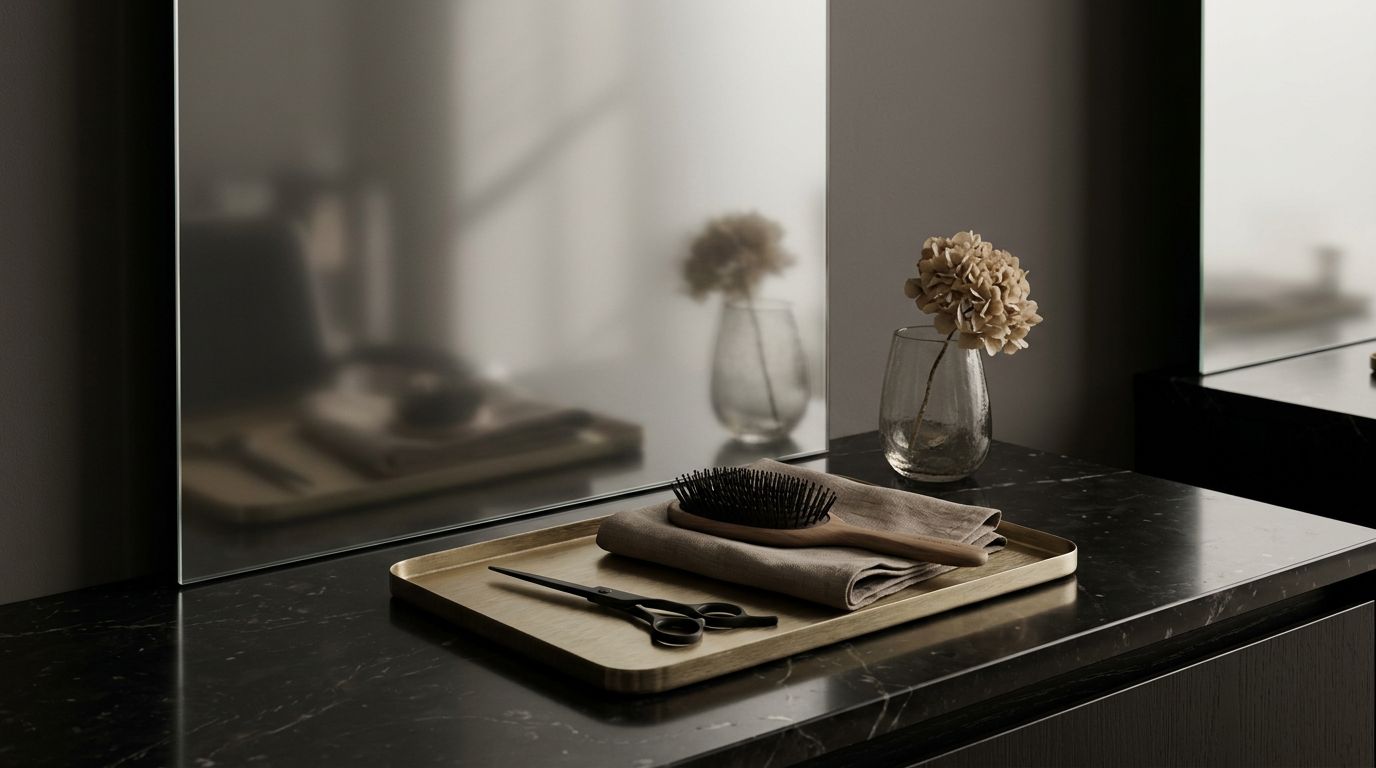
If your work is visual, display it using high-quality professional photography. Salons, estheticians, makeup artists, and many wellness brands need strong imagery. That might mean before and after photos, a few portfolio highlights, or branded images that showcase your space and experience. Don’t overdo it. A curated selection beats a giant scroll-fest. If you offer long-term transformations, consider including brief case studies to show the progression of your work.
You can also add trust signals like years of experience, certifications, awards, or press mentions. I spent 20 years in the beauty industry, and one thing I know for sure is this: clients notice when a business looks put together online. They may not say it out loud, but they feel it.
This is where a real website does more than a booking app ever will. A booking app can handle appointments, but your website builds confidence for potential clients before they ever book. It helps them picture the experience, understand your brand, and feel like saying yes is the easy choice.
A short about section helps here too. Keep it brief. One photo, a few lines, and a reason to trust you. You don’t need your life story. You need enough personality and proof to feel human.
Answer the questions people have but don’t always ask
People are curious. They are also busy, distracted, and one tiny annoyance away from leaving your site.
So your homepage should answer the questions floating around in their head before they bounce back to Instagram. For local businesses, that often means location or service area. For beauty and wellness brands, it may also mean including new client info, booking details, and what to expect.
A short FAQ section can do a lot of heavy lifting. It can cover questions like who your services are best for, whether consultations are required, how new clients should book, or what happens if someone is nervous and has no clue what to choose. That kind of detail reduces hesitation.
If most of your traffic comes from Instagram, assume people are viewing your homepage on their phone while standing in line somewhere. This is where mobile responsiveness becomes essential. Make the contact information easy to find and the buttons easy to tap. Keep the text tight, and do not hide your most important info halfway down a dramatic scrolling experience that belongs in a perfume campaign.
Your homepage should open the conversation, then guide people to the deeper landing pages.
What this looks like for a salon homepage
Hair salons need a homepage that feels polished, current, and easy to trust. It should not be chaotic or cheesy. It should not look like something you made at 11:47 p.m. while pretending it is professional. Your goal is to foster brand recognition so that potential clients remember your name the moment they need a haircut or color.
If I were laying out a homepage for a salon to maximize lead generation, I would keep the order simple:
- A strong headline with the salon’s specialty, audience, and location
- A short intro with one clear booking button
- A preview of top services
- A few photos that show the work and the vibe
- Social proof including client testimonials
- A short stylist or brand intro
- New guest details or process
- A lead magnet, such as a helpful guide or discount, for those not ready to book yet
- A final call to action
This structure also works for med spas, estheticians, wellness studios, and other service-based brands. While the specific details change, the goal remains the same. You want people to feel confident, informed, and ready to take the next step.
If your current online presence is mostly a booking app, a link-in-bio page, or a site you avoid looking at, you are not stuck. A homepage can be simple, beautiful, and much more effective than a patchwork setup. As a local service provider, you might be tempted to use a basic website builder or try to set up WordPress yourself. However, if you would rather skip the DIY spiral and get a custom website in a day, that is a much better use of your weekend than fighting with fonts and second-guessing every headline.
Frequently Asked Questions
Should I include my full price list on my homepage?
You do not need to list every individual service cost, but including “starting at” prices helps filter potential clients and sets clear expectations. This transparency prevents mystery and ensures that visitors have a general idea of your pricing structure before they commit to booking.
How many services should I feature on my homepage?
Feature only three to five of your core offers to avoid overwhelming your visitors with too many choices. Use your homepage as a preview that links directly to detailed, dedicated service pages where they can learn more.
Why are client testimonials so important for my homepage?
Testimonials act as essential social proof that confirms your expertise to skeptical visitors. Authentic reviews that mention specific results or positive feelings help potential clients visualize the value you provide, significantly increasing your conversion rate.
Should my homepage be optimized for mobile devices?
Yes, since a significant portion of traffic for service-based businesses often comes from social media, your site must be mobile-responsive. Ensure that your text is easy to read, your buttons are simple to tap, and your most critical information is accessible without excessive scrolling.
Your homepage should do more than look cute
A good homepage does not need to say everything. It needs to say the right things in the right order, with enough clarity that the right client keeps going. When your homepage clearly explains what you do, shows proof, and gives people an easy next step, your business feels more professional right away. That is the shift most beauty and wellness brands are after.
If your site looks nice but still is not pulling its weight, start with the homepage. Effective website design is about more than just aesthetics; it is about balancing search engine optimization with a seamless user experience that guides potential clients toward a booking. You can check Google Analytics to see exactly how visitors are interacting with your site and identify where they drop off. By organizing your content assets like testimonials and service photos more effectively, you can reduce confusion and build the confidence necessary to turn a casual browser into a loyal customer. Remember, the homepage is where your brand story is fixed and where your growth begins.


Get a rock star website in 1 day!
One day. One dreamy website.
My Website in a Day service is perfect for beauty pros who need a polished, professional online presence—like, yesterday. We’ll take one of my custom-designed Showit templates and tailor it to your brand, style, and services in just one day. You’ll walk away with a site that books clients, builds trust, and looks like a million bucks (without taking forever to launch).


