")


You can have gorgeous treatment rooms, expensive devices, and a team people trust. A poor digital marketing strategy can tank your conversion rate, and if your medical spa website design feels confusing, slow, or vague, those consults can disappear before anyone reaches out.
That is the sneaky thing about med spa website design. The problem usually is not one giant disaster. It is a pile of small trust-breakers that make people think, “Hmm, maybe not.”
A booking app can collect appointments. A real website helps someone feel safe enough to ask about their face. That is where the difference shows up.
Key Takeaways
- Your homepage has five seconds to answer what you do, who it’s for, where you are, and what to do next—skip the fluff and clutter for clear above-the-fold booking cues.
- Build trust with real proof like provider bios, professional photos, specific treatment details in plain English, and testimonials, not just vague luxury vibes.
- Cut friction fast: optimize for speed and mobile, use strong CTAs like “Book a Consult” everywhere, and keep forms simple to avoid losing ready-to-book visitors.
- A polished website with SEO, clear navigation, and brand-aligned design outperforms booking apps or social alone by warming up leads and boosting conversions.
When your homepage tries to do too much
Your homepage has about five seconds to deliver a positive user experience. If it opens with a fluffy headline, a random stock photo, and six different buttons, people are not impressed. They are confused.
Pretty is not enough here. In med spa website design, a homepage should quickly answer four questions: what you do, who it’s for (your target audience), where you are, and what to do next. If the first screen says something like “Reveal your glow” and nothing else, that is not strategy. That is wallpaper.
The same above-the-fold rule that helps salons book more clients also applies to med spas. This breakdown of above-the-fold booking cues nails the issue. Your first screen should not make people guess.
Then there is the clutter problem. Too many treatment promos. Too much tiny text. A popup asking for an email before the visitor even knows what you offer. It feels like walking into a spa lobby where three people shout at you at once. Hard pass. User-friendly navigation can remedy this by guiding visitors smoothly.
A homepage does not need to say everything. It needs to make the next step obvious.
Another mistake, hiding your actual services under vague aesthetic treatments. If someone is searching for Botox, lip filler, laser hair removal, or microneedling, your site should say that clearly. Your city should be easy to find too. The American Med Spa Association points out that patients often search by treatment and location for local search results, which supports search engine optimization, not by your brand name alone.
Luxury without proof does not build trust
A lot of med spa sites in the medical aesthetics industry swing too far in one direction. They either look cold and clinical, or they look so vague and polished that they barely feel medical. Neither one works.
People want both sides of the experience. They want the calm, polished feel of clean aesthetics in a premium service. They also want proof that trained professionals are doing the work. If your site shows candles, beige robes, and close-ups of eucalyptus, but says almost nothing about the providers, that trust drops fast.
This shows up on service pages too. Some sites lump every treatment onto one long page and call it a day. Others use technical wording with no plain-English explanation. Neither helps someone decide whether they are a good fit. A stronger page explains what the treatment is, who it is for, what concerns it helps, and why a consult may be the right next step.
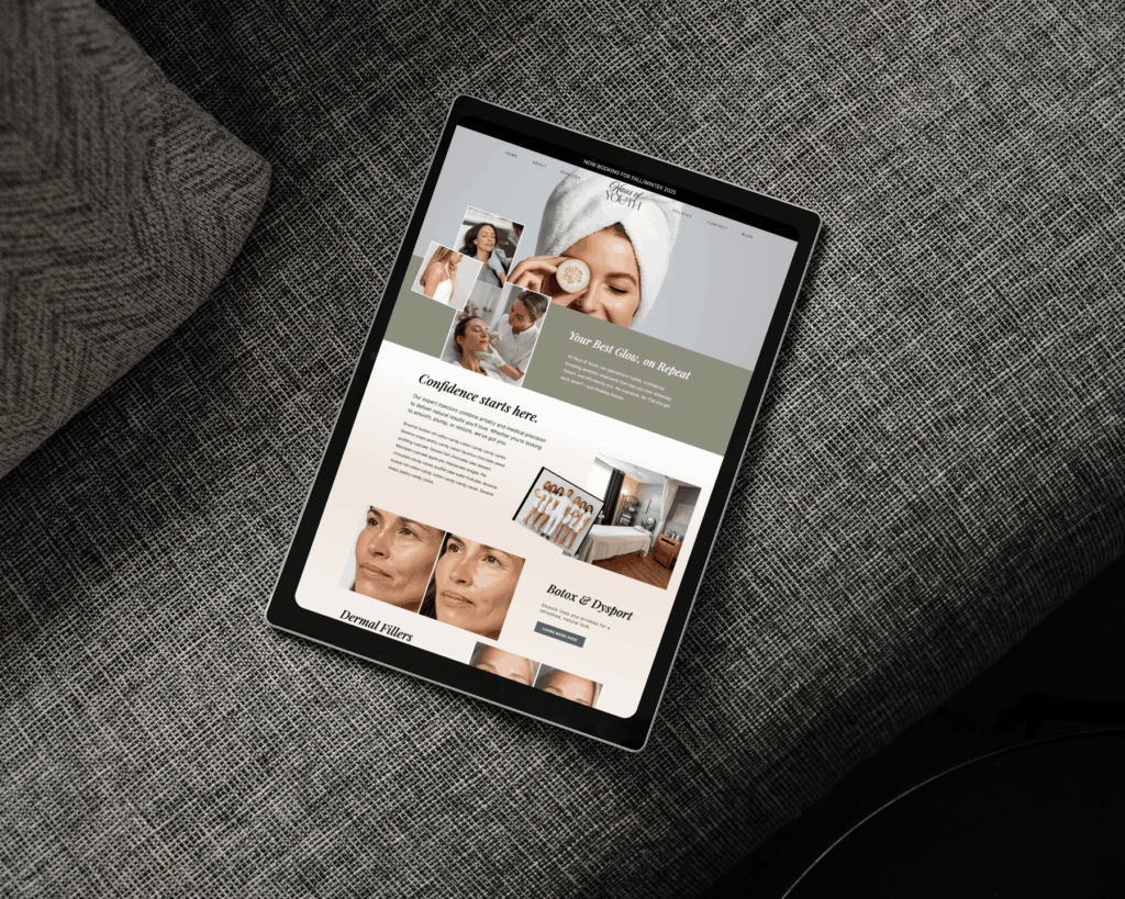
Real photos matter here. Real provider bios matter. Real before-and-after-photos, used appropriately and with consent, and patient testimonials matter. Your website should feel like your actual business with your brand identity, not a generic template. Opt for professional photography and high-quality visuals to build a premium feel.
And yes, this is why relying on Instagram or a booking app alone falls short. Social media can catch attention. A booking app can handle logistics. Neither gives the full brand experience or social proof people need before they trust you with a consult. Your site should make your business feel polished, professional, and easy to say yes to.
Tiny bits of friction add up fast
Even a beautiful site can lose consults if the user experience is annoying. This is where a lot of med spa websites quietly mess things up.
Loading speed is a big one. If your pages drag because your images are enormous, or mobile feels clunky due to poor responsive design and lacking mobile optimization, people leave. They do not wait around because your font choices are pretty. Again, AmSpa’s guidance calls out slow, hard-to-use mobile websites without proper mobile responsiveness as a direct problem for visibility and patient action.
Calls to action get botched all the time too. “Learn More” is weak when someone is ready to ask about treatment. “Book a Consult” is clearer. The button should not live on one lonely page either. It should show up throughout the site, especially on service pages where interest is highest.
Forms can be another mood killer. If a new visitor has to fill out twelve fields, explain their full history, and pick from a giant dropdown before saying hello, that is too much. Picktime notes that slow replies and overloaded first interactions can push clients away. People want guidance for appointment scheduling, not homework.
An online booking app on its own is not a full online presence. It is basically checkout with nicer lighting. Your website should warm people up first, answer the obvious questions, and make the booking process feel easy.
What better med spa website design looks like
The best med spa website design is not louder. It is clearer.
They lead with a strong first screen, simple navigation, specific services, and a clear path to book with search engine optimization in mind. They show the team, explain treatments in normal language, and repeat the next step without being pushy. They also match the quality of the in-person experience, which matters a lot in beauty and wellness. Improving user experience like this leads to a higher conversion rate.
That same approach works across beauty businesses, from med spas to salons. When your site feels polished and aligned with your brand, it strengthens your online presence as part of your digital marketing strategy. People notice. When it feels DIY, outdated, or stitched together from five random tools, they notice that too.
For business owners who are over the DIY spiral, the Done-For-You Showit Website Intensive offers custom web design that utilizes visual storytelling, a much faster fix than spending another season tweaking a site that still does not convert.
Frequently Asked Questions
Why does my med spa homepage confuse visitors?
It likely crams too much—fluffy headlines, stock photos, multiple buttons—without quickly answering what you offer, who it’s for, your location, and the next step. Clutter and vague language make people bounce in seconds. Focus on a simple above-the-fold layout with clear booking cues to guide them smoothly.
How can I build trust on my website without looking generic?
Show real provider bios, professional photos of your space and team, consent-based before-and-afters, and patient testimonials. Explain treatments in plain English, who they’re for, and why a consult fits. This blends premium aesthetics with medical credibility, making your site feel like your actual business.
What user experience mistakes kill med spa consults?
Slow loading, poor mobile responsiveness, weak CTAs like “Learn More,” and overloaded forms create friction that adds up. Visitors won’t wait or do homework just to book. Prioritize speed, repeat “Book a Consult” buttons, and simple interactions to make saying yes easy.
Is a booking app or Instagram enough for my online presence?
They handle logistics or attention but lack the full brand story, trust-building proof, and SEO needed to convert searchers. A website warms people up with clear service pages and social proof before booking. Pair them, but lead with a professional site that matches your in-person quality.
How does SEO fit into med spa website design?
Patients search by specific treatments like Botox or microneedling plus your city, not just your brand. Make services and location prominent for local search visibility. Clear, optimized design with fast mobile performance boosts rankings and turns search traffic into consults.
Final Thoughts
If consults are slipping through the cracks, your website may be part of the problem. Not because it needs more fluff, but because it needs more clarity, more proof, and less friction.
In the medical aesthetics industry, a professional medical spa website design paired with effective search engine optimization builds a robust online presence. This makes people feel confident before they book aesthetic treatments. When the site is clear, professional, and easy to use, it stops being a weak spot and starts doing its job.


Get a rock star website in 1 day!
One day. One dreamy website.
My Website in a Day service is perfect for beauty pros who need a polished, professional online presence—like, yesterday. We’ll take one of my custom-designed Showit templates and tailor it to your brand, style, and services in just one day. You’ll walk away with a site that books clients, builds trust, and looks like a million bucks (without taking forever to launch).


