")


Luxury isn’t loud. It doesn’t need to scream in neon, “I’m premium!!” like a clearance sticker on a bottle of shampoo from 2009.
A luxury beauty color palette delivers the essence of luxury branding through a calm, confident vibe check. It supports your premium positioning by making clients perceive you as experienced and your space as impeccably clean (even before they read a single word). Let’s talk about how to choose colors that look expensive on your website, your product shots, and your salon’s Instagram grid, without turning your brand into a highlighter pack.
What makes a luxury beauty color palette feel expensive (not “extra”)
In luxury branding, color choices usually have one thing in common: restraint. Not “boring,” not “beige for the sake of beige.” Restraint, guided by color psychology, means every color has a job.
First, luxury palettes tend to live in a tighter range. You’ll see softened neutral tones, muted shades as moody darks, and one polished accent. That’s because luxury brands sell trust. When everything is bright, everything competes. When everything competes, nothing looks intentional.
Second, undertones matter more than people think. Creamy ivory feels warm and inviting. Stark white can feel clinical. A “soft black” reads modern. Pure black can feel harsh, especially next to warm skin tones and hair photography.
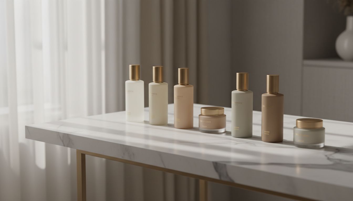
Texture also matters, even on a screen. A palette that feels luxe often evokes high-end design through real materials like stone, leather, satin, brushed metal, and rich wood. If you need visual references, this roundup of luxury color palettes for wellness brands is a helpful way to see how neutrals and accents can still feel fresh.
Quiet luxury is a whisper. If your palette is yelling, your brand’s doing emotional labor it shouldn’t have to.
Finally, think about how your colors behave in real life, as this directly shapes brand perception. Salon photos are full of warm highlights, skin tones, and mixed lighting. If your brand colors fight your imagery, your whole website feels “off,” even if nobody can explain why.
How to build a luxury palette that still feels like you
A good luxury beauty color palette has structure for stronger brand recognition. Not vibes only, bestie.
Think in roles, not in “favorite colors,” following your brand guidelines:
- Base (backgrounds): the calm foundation, usually a warm white, cream, or soft neutral.
- Ink (text): what you’ll use instead of pure black, like deep charcoal or espresso.
- Accent (sparingly): one standout detail color for buttons, links, icons, or small graphic moments.
- Support (optional): a second neutral for sections, cards, or subtle contrast.
Before you pick shades, decide what “luxury” means for your brand and its consumer personas. For a hair salon, luxury might mean editorial and sleek. For a facial studio, it might mean quiet and spa-like. For lashes, it might mean dark, glossy, and dramatic. Color psychology plays a key role here in shaping your visual brand identity.
Here’s a quick way to sanity-check your color selection:
| Choice | DO (feels elevated) | DON’T (feels chaotic) | What clients assume |
|---|---|---|---|
| Saturation | Muted, softened tones | Neon brights everywhere | Calm expertise vs. “sale energy” |
| Contrast | Intentional, readable | Harsh or random contrast | High-end vs. messy |
| Accents | One refined accent | Three “main” colors | Premium vs. unpolished |
| Neutrals | Warm or cool, consistent | Mixed undertones | Cohesive vs. accidental |
If you want a peek at common salon directions (especially for interiors), this list of popular hair salon color schemes can help you spot what you’re drawn to, then refine it into sophisticated color stories.
Also, your website layout and typography amplify your palette. A minimalist aesthetic paired with editorial type feels instantly “more expensive.” That’s why templates with a bold, fashion-forward vibe can be a great starting point, like the Strand Society Showit template (especially if you want that modern, high-end salon look without reinventing the wheel).
Do and don’t color palette examples (plus how to use them on a salon website)
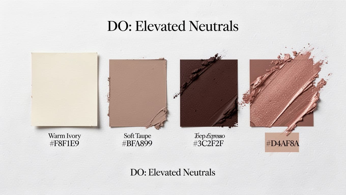
DO: Elevated neutrals plus one refined accent
The safest way to look luxury without looking basic: choose 2 to 3 neutral tones, then add one accent that feels like jewelry. This timeless elegance captures earthy sophistication with a touch of rose gold romance.
Example:
- Warm ivory (like #F8F1E9)
- Soft taupe (#BFA899)
- Deep espresso (#3C2F2F)
- Muted rose-gold accent (#D4AF8A)
Use it like this: ivory backgrounds, espresso text, taupe sections, metallic accents like rose-gold only for buttons and tiny details. Keep it consistent across your whole site, beauty packaging, and product packaging, not just your homepage.
DO: Monochrome depth (aka “expensive minimal”)
Monochrome doesn’t mean flat. It means layered, embodying modern minimalism.
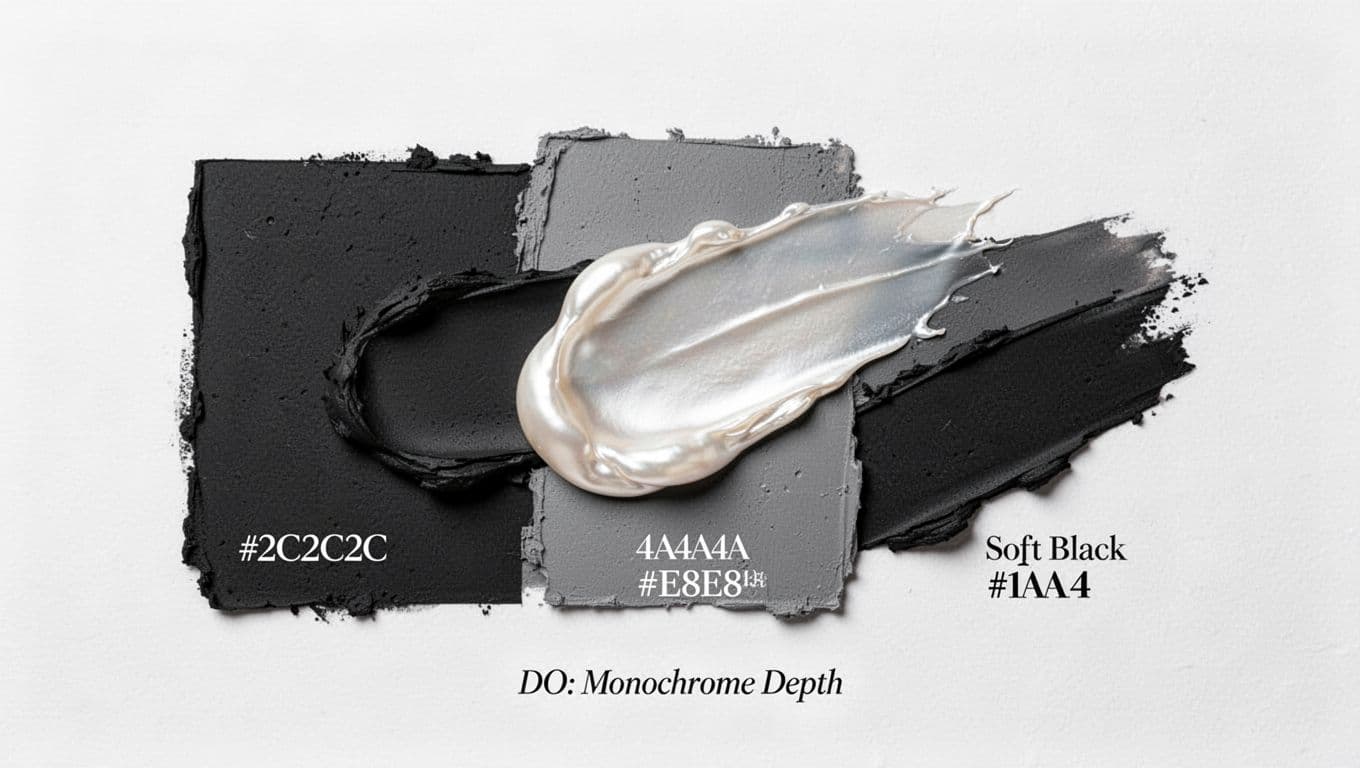
Example:
- Soft black (#1A1A1A)
- Charcoal (#2C2C2C)
- Mid-gray (#4A4A4A)
- Satin pearl highlight (#E8E8E8)
This works ridiculously well for hair salons that want an editorial feel, much like wellness brands achieve high-end design. Unlike stark gold and black, pair it with warm, natural photography so it doesn’t go full goth bathroom (or coastal serenity overload). Then use the pearl tone for negative space, so the site can breathe.
DON’T: Oversaturated brights with harsh contrast
Bright can be fun. Bright can be youthful. Bright can also read cheap fast if you don’t control it.
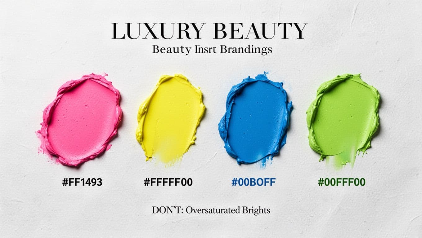
If your palette looks like hot pink (#FF1493), neon yellow (#FFFF00), electric blue (#00BFFF), and lime (#00FF00) all fighting in the group chat, luxury clients won’t feel calm. They’ll feel like they should be earning points for being on your site. Extend that chaos to beauty packaging or product packaging, and you lose brand cohesion entirely.
If you love color, keep it, just “luxury-ify” it:
- Trade neon for jewel tones or dusty versions.
- Use one bold shade as a micro-accent, not a background.
- Ground it with strong neutrals so your photos stay the main character.
One more thing, don’t sacrifice readability for aesthetics. Your “Book Now” button shouldn’t require squinting or a prayer. A gorgeous palette that fails basic contrast checks costs you bookings.
If you’re also tightening your messaging (which makes any palette work harder), these hair salon About page examples help you pair elevated design with words that actually build trust.
When you want the whole thing done fast (colors, fonts, layout, and launch), that’s exactly what Showit Website in a Day for beauty pros is for. One day, one polished site, zero spiraling over whether your beige is “too sad.”
Conclusion
A luxury beauty color palette isn’t about picking the “prettiest” colors, it’s about picking the most intentional ones that reflect your brand ethos. Keep your neutrals consistent, your accent refined, and your contrast readable. Most importantly, let your photos and your work shine, because that’s what clients came for. When your luxury color scheme looks elevated, it creates an exclusive customer experience, infusing your luxury branding with organic authenticity. This makes your entire brand feel easier to trust (and easier to book).


My Website in a Day service is perfect for beauty pros who need a polished, professional online presence—like, yesterday. We’ll take one of my custom-designed Showit templates and tailor it to your brand, style, and services in just one day. You’ll walk away with a site that books clients, builds trust, and looks like a million bucks (without taking forever to launch).


