")
")


You bought a gorgeous Showit website template. It’s giving luxury salon, soft neutrals, and “my prices start at $200” energy. Then you go to change one tiny thing (a font, obviously) and suddenly your headline is sitting on top of your button like it pays rent there.
This Showit template customization guide is for beauty business owners and creative entrepreneurs who want the fun part (making it reflect your brand identity) without the chaos part (breaking the layout and panic-Googling at midnight). We’ll cover how to swap fonts, update colors, and move sections safely, especially if you’re a hair salon owner who already has enough surprises in a day.
Start with layout safety, because future-you deserves peace

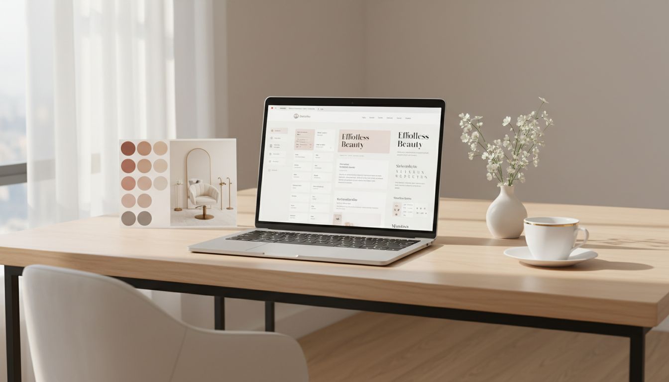
Photo by Firmbee.com
Before you touch fonts or colors in Showit’s drag-and-drop interface, set yourself up like you’re mixing lightener. Gloves on, boundaries in place.
Here’s the quick order that saves layouts as part of your website strategy:
- Duplicate the page (or site) first. If something goes sideways, you’ll have a clean backup.
- Change global styles before you change individual elements. Showit is happiest when you update styles once, then let them ripple through your design.
- Work desktop first, then mobile. Showit’s mobile design is separate, so a “perfect on desktop” moment can still be a mobile mess unless it’s fully mobile-friendly.
While customizing, you might also want to set up your WordPress blog for future marketing.
Also, February 2026 Showit reality check: there’s no magical new “swap everything perfectly” button. However, recent improvements to the Showit subscription make editing easier. Showit added zoom controls (including “Zoom to Fit”), light mode and density settings, layer grouping, a newer button element with Primary/Secondary styles, image cropping, and brand colors preview. Those don’t prevent layout issues by themselves, but they do help you see what you’re doing and fix problems faster.
Pro tip: If you’re squinting and rage-scrolling, turn on Zoom to Fit and use the SPACE key to drag the stage. Your eyes will stop filing complaints.
If you want a template built for beauty pros from the start, start with something like the Hygge Hair Showit template, it’s designed to stay calm even when you’re not.
How to swap fonts in Showit without the “why is everything moving” drama
Typography feels simple until your spacing changes, your line breaks shift (especially when replacing placeholder content with your actual copy), and your tidy layout turns into a game of typographic Jenga. The trick is to change fonts in a way that respects the template’s structure, just like professional templates from Showit designers do to avoid that drama.
Start with text styles (global), not random text boxes. Most well-made templates use consistent heading and paragraph styles. Update those styles first so your changes apply across the site. When you update one H1 style, you’re not hunting down 47 headlines like it’s an Easter egg situation.
Next, watch for the three font changes that cause the most layout problems:
1) Font width changes
Some fonts are naturally wider. When you swap a slim font for a chunky one, your line breaks change. That can push text outside its box or into other elements. Fix it by resizing the text box slightly or adjusting font size a notch down.
2) Line height (leading)
Line height changes can make text overlap, especially in stacked headings or tall service lists, affecting mobile responsiveness. Keep line height readable, but not floaty. If your “Lived-in Blonde Specialist” headline looks like it’s wearing shoulder pads, tighten the line height, and always check mobile view.
3) Letter spacing
A little tracking can look high-end. Too much makes it look like your website is whispering. Increase letter spacing only after you confirm the layout still holds.
Finally, use Showit’s newer layer grouping when you need to move a headline, subhead, and button together. Group them, nudge them, then ungroup if needed. It’s like moving a salon station without spilling your iced coffee.
For Showit’s own tips on customizing templates (straight from the source), bookmark Showit’s guide to customizing website templates. It’s a solid reference when you need a second opinion that isn’t your cousin who “builds websites.”
How to change colors (and keep your site looking intentional, not accidental)
Color is where templates get personal fast. It’s also where things go wrong fast, like neon buttons on a soft luxury brand. The goal is simple: change colors once, then apply them consistently to create a cohesive visual identity.
Start in your brand color area, because Showit’s brand colors preview helps you see your color palette before you publish. Then use those saved colors everywhere. Clicking around and “eyeballing it” leads to 11 shades of beige, and none of them match your logo.
A smart color swap usually follows this pattern:
- Set 3 to 5 core colors: background, text, accent, neutral, and one “pop” (if your brand needs it).
- Update backgrounds and large blocks first: sections, canvas fills, big shapes.
- Then update accents: buttons, links, icons, lines.
Also, pay attention to buttons. Showit’s newer button element supports Primary and Secondary styles, which makes it easier to keep your calls-to-action consistent. For example, your primary button can be “Book Now,” your secondary can be “View Services.” Same shape, same rules, no random button colors sneaking in like an uninvited plus-one.
Quick salon-specific note: if your brand photography is warm and golden, icy gray backgrounds can make everything feel off. Let your brand photography lead the color palette, not the other way around.
If you’re a salon owner who just wants it handled quickly, this is exactly what my Website in a Day Showit service is for, blending template customization with custom website design. You show up with your brand vibe, I handle the color system and often include custom copywriting to match the new visual vibe, so your site looks expensive on purpose.
How to swap sections and pages without breaking spacing, alignment, or mobile
Swapping sections is where confidence goes to die, because dragging one thing can shift five others. Still, you can do it safely if you treat sections like building blocks, not confetti.
Copy and paste sections instead of rebuilding them. If your Showit website template includes a testimonials section you love, duplicate it and edit the content. Update it with your SEO keywords to support search engine optimization and protect your rankings. That keeps spacing, font hierarchy, and alignment intact.
When you bring in a section from another page, do two checks immediately:
First, check the canvas size and margins. If the pasted section lands slightly off, don’t start manually moving every element one by one. Instead, select the group (or group it), then align it to the canvas for smooth layout personalization. Consistent margins are what make a site feel “designer.”
Second, check mobile right away. Showit’s desktop and mobile layouts are separate, so a perfect desktop paste can create mobile overlap. Open the mobile view, then stack elements cleanly. Make conversion-focused buttons thumb-friendly, and give text room to breathe.
Also, don’t forget images. Showit’s image cropping tool makes it easier to fit stock photos into existing frames without opening another app. That’s a win, especially if you’re swapping out stock photos for fresh salon imagery and need it to look polished fast.
One more thing that saves time: if you need a quick one-page layout to get online now, grab the Showit one-page salon website template. It’s a solid starting point when you’re busy behind the chair and your website has been “coming soon” since last summer.
Conclusion
A clean edit in Showit comes down to three moves: update global styles first, make small changes on purpose, then confirm mobile before you celebrate. Fonts and colors should feel like a brand upgrade, not a layout gamble.
If you’re ready for a high-end website without eating your whole week, book a Website in a Day as your Showit Design Partner. We’ll handle domain transfer and launch graphics to get you launched fast, with zero layout meltdowns and maximum “wow, you look legit” energy. Training videos are included so you can manage your site post-launch. Not quite ready? Start with a website discovery.


My Website in a Day service is perfect for beauty pros who need a polished, professional online presence—like, yesterday. We’ll take one of my custom-designed Showit templates and tailor it to your brand, style, and services in just one day. You’ll walk away with a site that books clients, builds trust, and looks like a million bucks (without taking forever to launch).
")


