")


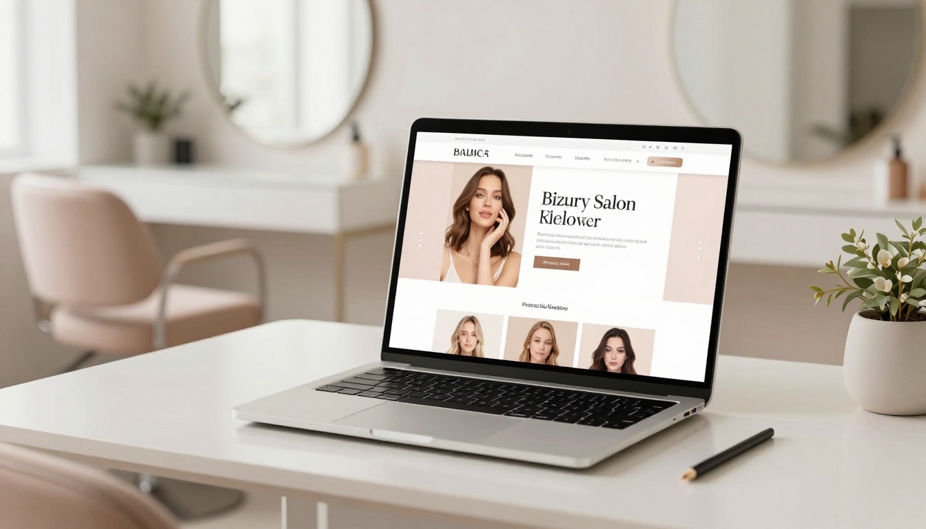
Your homepage, the landing page of your beauty salon website, is your online front desk. And if it’s giving “confused receptionist on their first day,” clients won’t book, they’ll bounce.
A high-performing beauty pro homepage doesn’t need to be long. It needs to be clear. Think of it like a great haircut: strong shape, clean lines, zero chaos.
Below are five homepage sections designed for optimal user experience and to attract premium clients using swipeable copy prompts. They help hair salons and beauty pros book higher-paying clients without begging people to “DM for details.” Each one includes copy prompts you can steal, tweak, and make your own.
1) A hero section that says what you do (in 5 seconds)
The hero section is the first screen people see. It’s the place to establish a clear value proposition and earn the right to keep their attention.
Premium clients don’t want to solve a mystery. They want to know: What’s the service, who’s it for, where are you, and what do I do next? If your headline is “Welcome to my page,” it’s not helping.
A strong hero includes:
- A clear one-line offer (not your life story)
- Your location (if you’re local, say it; using local search terms is vital for regional discoverability)
- One primary call to action (don’t give five exits)
If you’re a hair salon, be specific. “Color specialist” hits harder than “I love making people feel beautiful,” even if that’s true.
Swipeable copy prompts
- Headline: “Lived-in color for busy women in (City) who want gorgeous hair without the 6-week panic.”
- Subhead: “Custom blonding, dimensional brunettes, and healthy hair plans. Luxury service, zero awkward vibes.”
- Button: “Book Your Appointment” or “Apply to Work Together” (clear and direct microcopy)
2) Instant social proof that you’re worth the price
Premium clients have options. Your job is to make them think, “Oh, she’s the one,” before they scroll themselves into another salon’s booking link.
This section is not the place for a blurry collage from 2018. Use your best work and let it breathe. A few strong images beat a hundred tiny ones.
Add social proof in different forms so it feels real:
- High-quality before/after photos (same lighting if possible). Before and after results are most effective when using professional photography.
- Short testimonials with specifics (what changed, how it felt)
- Numbers if you have them (years behind the chair, awards, training)
If you struggle with testimonials, prompt your clients to share testimonials. People love talking about themselves, just ask the right way. Testimonials build trust and emphasize your expertise.
Swipeable copy prompts
- Section intro: “You don’t need a new personality. You need a color plan.”
- Testimonial ask: “What were you tired of dealing with before we worked together?”
- Testimonial display: “I finally stopped ‘fixing’ my hair with a claw clip. My blonde looks expensive again.”
3) Services that feel premium (without listing every single thing)
Your services section should make booking feel simple and high-end, not like reading a service menu with 42 options.
A well-organized service menu ensures the site is high-converting and increases overall conversion rates. This section also acts as a digital portfolio for the stylist, showcasing signature services that drive even higher conversion rates.
Here’s the move: group your offers into 3 to 6 “signatures” that match how your best clients actually buy. They’re not shopping for “partial foil plus toner plus gloss plus add-on,” they’re shopping for an outcome.
For hair salons and stylists, outcomes sound like:
- “Dimensional Brunette Refresh”
- “Lived-In Blonde Session”
- “Curly Cut and Shape”
- “Extension Transformation”
You can share “starting at” prices or ranges if you want. What you don’t want is the classic chaos line: “Prices vary, DM me.” That’s how you attract bargain hunters and tire yourself out.
Swipeable copy prompts
- Service lead-in: “Choose your path to hair that behaves.”
- Signature offer blurb: “For the client who wants depth, shine, and a grow-out that still looks good at week 10.”
- Pricing line: “Investment starts at $___, final quote after your consult.”
- Call to action (booking button): “Book Your Signature Session Now”
4) A “how it works” section that removes booking fear
A premium client is not always a fearless client. Even high-budget people get nervous about new salons. They worry about time, awkwardness, surprise costs, and walking out looking like a different person.
This is where you calm the nerves and set boundaries without sounding like a school principal. Frame these steps as a lead generation strategy to build trust from the start.
Integrating modern booking tools improves the user experience and reduces friction. Spell out what happens after they click book, and what you expect from them. This also reduces no-shows because people know what they’re committing to.
Keep it short and friendly. Three steps is usually perfect, with the final step serving as your call to action. If you have policies, mention them in a way that sounds confident, not angry.
Swipeable copy prompts
- Step 1: “Book your appointment (or fill out a quick form if you’re new here).”
- Step 2: “We create a plan, talk budget, and get you feeling 100 percent sure.”
- Step 3: “You leave with hair that looks expensive and a maintenance schedule that fits your real life.”
- Policy line: “Because I save your time, I also protect mine. A card on file holds your spot.”
5) An about section that builds trust (not a biography essay)
This section isn’t here to prove you’re interesting. It defines your brand identity and proves you’re the right choice.
Your about section should answer:
- Who you help
- What you’re known for
- What it’s like to sit in your chair (or walk into your salon)
- Why your work holds up
Keep it client-focused. Share personality, yes. Share your whole childhood timeline, no. Incorporate visual storytelling, as it helps establish a more professional online presence.
If you’re a salon owner, this is also a great place to position your space as an experience. Think: calm, clean, high-touch, and consistent.
And please, for the love of good lighting, use a sharp photo where you look like you run the place (because you do).
Swipeable copy prompts
- About opener: “I’m (Name), and I do hair for people who want polish without the pressure.”
- Authority line: “After (X) years behind the chair, I’ve learned what actually makes color look luxe: placement, tone, and a plan.”
- Vibe line: “Expect good music, honest consults, and zero pushy product speeches.”
Your homepage doesn’t need more pages, it needs stronger sections
If your beauty pro homepage is missing even one of these sections, you’re probably making people work too hard to book. Clarity sells. Confidence sells. A clear path from “I’m curious” to “I’m booked” sells most of all.
If you want this done fast, clean, and actually aligned with premium clients, website templates offer a fast solution for your beauty salon website, prioritizing responsive design and mobile-first design.
Your next client is already scrolling. Make your homepage act like it wants the job.


My Website in a Day service is perfect for beauty pros who need a polished, professional online presence—like, yesterday. We’ll take one of my custom-designed Showit templates and tailor it to your brand, style, and services in just one day. You’ll walk away with a site that books clients, builds trust, and looks like a million bucks (without taking forever to launch).


