")


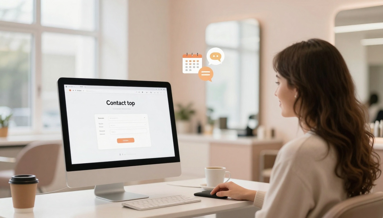
Your hair salon contact page shouldn’t feel like a DMV form with better lighting. It should feel like the front desk on your best day, friendly, clear, and ready to get someone booked without the awkward back-and-forth.
Most salon contact pages lose people for one boring reason: they make it too hard to take the next step. Too many fields, too many choices, too much mystery. Clients aren’t trying to “connect,” they’re trying to get their hair handled before their next event, breakup, or work trip.
Let’s fix it with the exact layout, fields, buttons, and copy that turn “just browsing” into “I’m booked.”
What a converting contact page actually needs to do
A contact page has one job: get the right person to the right action fast.
For a salon, there are usually three actions:
- Book now (most visitors)
- Ask a quick question (pricing, timing, hair history)
- Request a new client consult (higher-ticket services, color corrections, extensions)
If your page tries to treat all three like the same situation, it gets messy. Think of it like a salon shampoo bowl, it works great when it’s set up for one job.
Above-the-fold layout (what they should see first)
Above the fold means what shows up before scrolling. This is where conversions happen, because people are impatient and their thumb is strong.
1) A clear headline that says what this page is for
Skip “Get in touch” (yawn). Say what you want them to do.
Use this headline: Contact (and Book) Your Appointment
Or if you want it more direct: Ready for Great Hair? Let’s Get You Scheduled.
2) Two primary buttons, side-by-side
Don’t make them hunt. Give them the obvious paths.
Button 1 (primary): Book Appointment
Button 2 (secondary): Ask a Question
If you take consults, add one more option right under those buttons as a text link: New here? Request a consultation.
3) Your response-time promise
This calms anxious clients and cuts double-messaging.
Copy to use: I reply Tuesday to Saturday within 24 business hours. If you need a same-day slot, booking is the fastest option.
4) One tiny “panic button” for urgent needs
Some people hate forms. Some people are on a lunch break spiral. Give them an escape hatch.
Add small text under the buttons: Prefer to text? (555) 555-5555
Keep it clean, not a full paragraph of contact methods.
The exact form fields to use (and why)
Forms are like bangs: a little trim is fine, too much gets weird fast.
For most salons, this is the sweet spot. It captures what you need without making someone feel like they’re applying for citizenship.
The best contact form fields for a hair salon
Use these fields in this order:
- First name (required)
- Last name (optional)
- Email (required)
- Mobile number (optional, but recommended)
- Preferred contact method (required, radio buttons: Email or Text)
- What can I help with? (required, short dropdown)
Options:- Booking help
- Pricing question
- Hair extension inquiry
- Color correction inquiry
- Other
- Message (required)
- How did you hear about us? (optional)
That’s it. Eight is the max before people start lying just to finish.
If you do high-ticket services, add one “qualifier” field
For extensions, blonding packages, and corrections, add:
Budget range (optional but helpful)
Options:
- Under $300
- $300 to $600
- $600 to $1,000
- $1,000+
This isn’t about being snobby. It’s about not wasting anyone’s time, including yours.
Add this privacy line under the form (people look for it)
Copy to use: By submitting this form, you agree to be contacted about your request. No spam, no weirdness.
Buttons that get clicked (and the ones that don’t)
Buttons matter more than most salons think. “Submit” is the beige carpet of the internet.
Your form submit button
Use: Send My Message
Other strong options:
- Get My Question Answered
- Request a Consultation
Extra buttons that boost conversions (use sparingly)
If your salon gets lots of mobile traffic (it does), add these as small buttons or icons near the top or bottom:
- Call the Salon
- Text Us
- Get Directions
One note: if your front desk can’t answer calls consistently, don’t feature “Call” as the main option. Nothing kills trust like voicemail limbo.
Copy you can paste onto your contact page (no fluff)
Your copy should sound like a real human who has met a real client. Friendly, direct, slightly “I got you.”
Here’s plug-and-play copy that works for a modern salon.
Short intro paragraph (under the headline)
I’m so glad you’re here. The fastest way to grab an appointment is online booking. If you have a question first (totally fair), send a message below and I’ll get back to you within 24 business hours.
Microcopy under the message box
Helpful details to include: your current hair, your goal, your timeline, and any inspo pics you love.
Confirmation message (after they submit)
Thanks, you’re on my list. I’ll reply within 24 business hours. If you don’t see a response, check your spam folder (it’s always doing the most).
A simple contact page “stack” that works (top to bottom)
If you want the easiest layout that still feels premium, use this order:
- Headline + short paragraph
- Book button + ask-a-question button
- Response time line
- Contact form
- Salon address + hours
- Parking note (if relevant)
- Small FAQ (3 questions max)
Your contact page shouldn’t be a novel. It should be a welcome mat.
Mini FAQ ideas (keep it tight)
Pick three that match what you get asked weekly:
- Do you take new clients?
- What’s your cancellation policy?
- Do you offer consultations?
What to remove (yes, even if you “always had it”)
Some things hurt conversions because they add friction, confuse the client, or create busywork for you.
Here’s what to delete, lovingly.
| Remove this | Why it hurts | Use this instead |
|---|---|---|
| A form with 12 to 20 fields | People bounce or type nonsense | Keep it to 6 to 8 fields |
| “Submit” button text | It feels cold and generic | “Send My Message” |
| A huge list of services in a dropdown | It overwhelms and slows them down | 4 to 6 contact reasons only |
| Required phone number | Some clients won’t share it yet | Make it optional, ask contact preference |
| A long paragraph about your “mission” | Not the place, not the time | One short, warm paragraph |
| Multiple emails for different needs | Decision fatigue | One form, one inbox |
| A CAPTCHA that’s hard to solve | Frustrating on mobile | Use spam filtering behind the scenes |
Also, remove the guilt-trip copy like “Please allow 48 to 72 hours for a response.” It sounds like you don’t want to be bothered. If you truly need more time, say it kindly and clearly.
Want this built for you (without the back-and-forth)?
A high-performing contact page isn’t about fancy tricks. It’s about clean choices, clear words, and a layout that matches how clients actually behave. That’s the stuff that turns a Showit site into a booking tool, not just a pretty online business card.
If you’re ready for a done-for-you Showit site (or a Website in a Day), the contact page is one of the first places to tighten up. It’s where curiosity becomes cash, and where no-shows start getting filtered out by better clarity.
Conclusion
Your hair salon contact page should act like your best front desk person: warm, quick, and confident. Keep the fields simple, make the buttons obvious, and use copy that tells clients exactly what happens next. Cut anything that creates confusion or makes people work too hard. A few small changes can turn your contact page into a booking machine without making it feel pushy.


My Website in a Day service is perfect for beauty pros who need a polished, professional online presence—like, yesterday. We’ll take one of my custom-designed Showit templates and tailor it to your brand, style, and services in just one day. You’ll walk away with a site that books clients, builds trust, and looks like a million bucks (without taking forever to launch).


