")


High-end clients judge your salon’s digital presence before they ever smell your signature candle. These potential new clients aren’t “just browsing”; they’re scanning for ease, trust, and that quiet, expensive vibe. If your site feels messy, slow, or confusing, they’ll bounce in seconds and book somewhere else while standing in line for an oat milk latte.
This post breaks down the most common hair salon website mistakes that quietly repel luxury clients, plus simple fixes you can handle this week (no full rebrand meltdown required). The goal is more premium bookings, better search engine optimization, fewer back-and-forth DMs, and fewer no-shows from “I couldn’t find your pricing so I guessed” energy.
First impressions matter, design mistakes that make your salon look less premium
Luxury buyers read design like a menu. If the menu looks cheap, they assume the food is too.
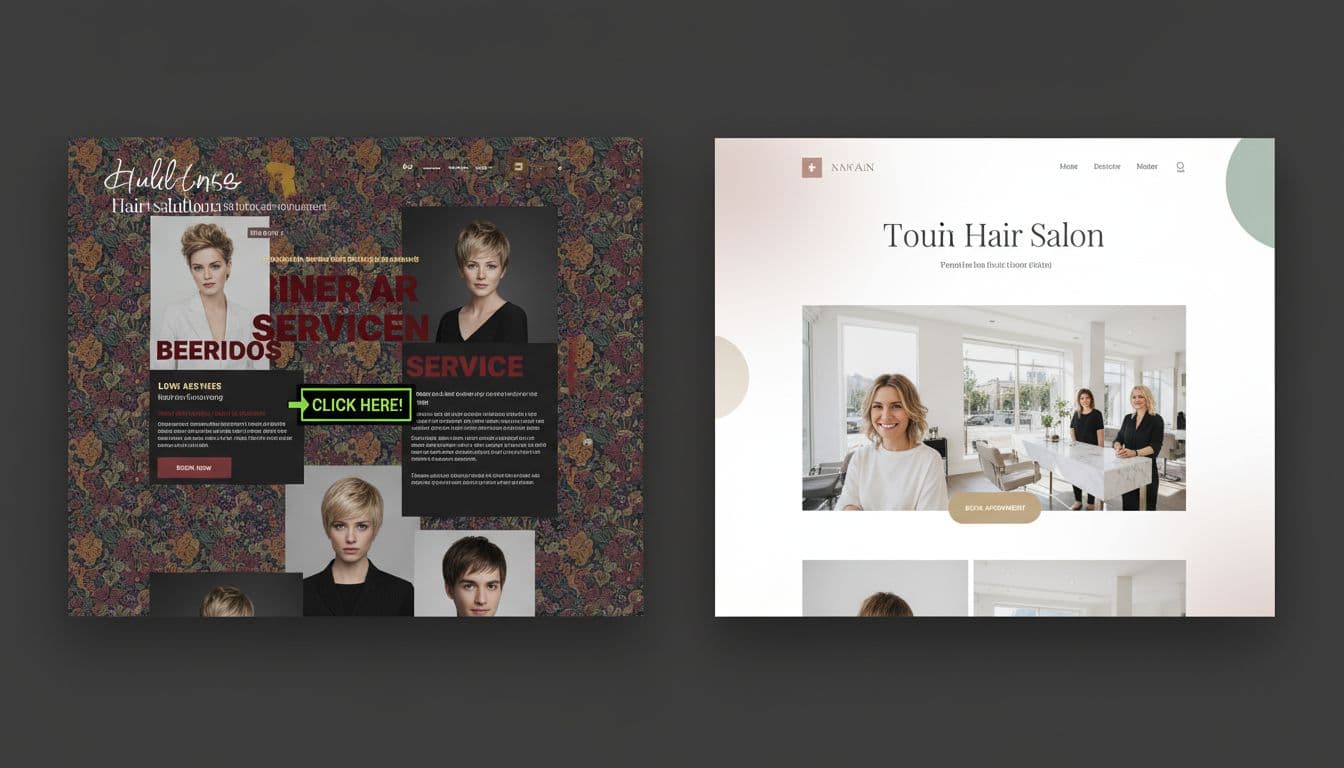
Mistake: Outdated visuals, cluttered design, or stock photos that don’t feel real
“Outdated” usually looks like this: too many fonts, busy backgrounds, blurry photos, weird spacing, broken pages, and a homepage that feels like a scrapbook from 2013.
Your work might be stunning, but your site is telling a different story.
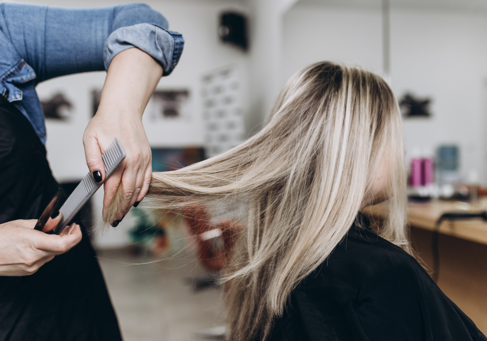
Fix it this week: Pick 2-3 fonts, max, and keep them consistent to reflect your brand personality. Give your sections breathing room with more white space. Replace generic stock images with professional photography of your team, your space, and your clients (with permission). If you can’t do a full brand guide, make a mini one: font names, 3 to 5 colors, button style, and photo vibe.
Mistake: No clear path to book, the homepage feels like a brochure
If someone lands on your homepage and has to play detective to figure out how to book, they’re out. Your target audience of high-end clients wants direction, fast. They’re not trying to scroll your entire life story while they’re between meetings.
Fix it this week: Put one primary call to action above the fold: the book now button. Repeat it in the menu and footer. Add a short “New Guest Start Here” section that tells them what to do in plain language (choose service, pick stylist if needed, book consult for color or extensions).
Friction kills bookings, user experience mistakes that make clients bounce
Most luxury clients book on their phone. Usually one-handed. Usually in under two minutes. If your site’s user experience fights them due to poor mobile optimization, you lose.
Mistake: Slow load times and heavy images that make your site feel frustrating
A slow site doesn’t feel “high-end”. It feels like waiting behind someone writing a check at a coffee shop. If pages take forever, people don’t think “maybe it’s the file size”. They think “this is annoying”.
Fix it this week: Compress images before uploading (a key technical SEO win). Keep videos to one or two key moments (like a short salon experience clip). Cut the sliders and extra animations that don’t help someone book. Shorten pages into clear sections so the site feels calm.
Mistake: Weak mobile experience, tiny text, hard taps, too many steps
On mobile, tiny text screams “I didn’t test this.” Same with buttons that are hard to tap, forms that feel like a tax document, or menus that hide important info. Poor mobile optimization creates a frustrating user experience that drives clients away.
Fix it this week: Check your site on your phone like a real client. Make buttons bigger, increase line spacing, and shorten forms. Add a sticky “Book” button if your platform allows it. Make sure key info is readable without zooming (hours, location, parking, price starting points).

Mistake: Online booking is missing, confusing, or sends people to the wrong place
Calls-only or email-only booking reads as outdated for a premium service. Also, if your online booking link sends people to a dead page, the wrong stylist, or a generic list of services that doesn’t match your site, it’s instant trust damage.
Fix it this week: Link to one online booking system, everywhere. Use service descriptions that match what clients actually look for (balayage, blonding, extension install, haircut). Create a simple “New Guest Booking” flow: what to pick first, what to expect, and when a consult is required.
Trust is the real luxury, messaging mistakes that make high-end clients hesitate
High-end clients aren’t only paying for hair. They’re paying for confidence, comfort, and not feeling awkward.
Mistake: Weak trust signals, no reviews, no results context, no team credibility
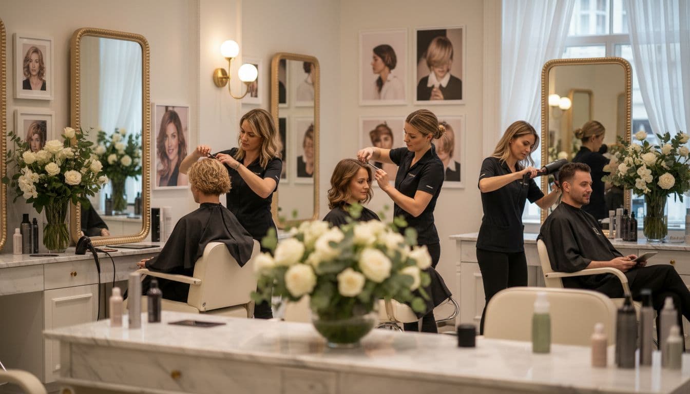
If your site has zero reviews, no stylist bios, and no proof beyond a few pretty photos, it feels risky. Luxury clients want receipts. They also want to know who’s touching their hair.
Fix it this week: Add client reviews to key pages, not just one hidden reviews page. Use real client reviews when possible. Add stylist bios with specialties, certifications, and a friendly photo. For results, include quick “case-style” context: the starting point, the plan, and the result (especially for corrections and extensions).
Mistake: Unclear services and pricing that feels hidden or confusing
Hidden pricing doesn’t feel exclusive, it feels like a surprise bill waiting to happen. High-end clients will pay, but they want to feel in control. If they can’t tell if you’re a $95 haircut salon or a $300 haircut salon, they’ll assume it’s not a fit and move on.
Fix it this week: Share starting prices or ranges. Explain what changes cost (length, density, correction work, add-ons). Add one clear consultation step for higher-ticket services, with a strong next action like “Book a Color Consult”. Include a short FAQ that answers money questions in plain language, like “Do you charge by the hour?”, “What counts as a correction?”, and “What is your no-show policy?” to manage client expectations.
Mistake: Mismatched info across your site, Google profile, and social pages
Nothing says “we’re not paying attention” like wrong hours, an old address, or a broken booking link. Inconsistent details hurt your local SEO, making it harder to be found online and damaging trust. Luxury clients read this as careless, even if you’re the best colorist in the county and appear in top local search results.
Fix it this week: Do a monthly “trust sweep” to boost local SEO. Check hours, phone, address, booking link, and service names on your website, Google Business Profile, Instagram bio, and other social media presence, booking platform, and online directories. Keep one “source of truth” doc so updates happen once, then get copied everywhere.
Modern expectations, technology, and follow-up mistakes that cost premium clients
A high-touch experience can still be automated. It just can’t feel like spam.
Mistake: No quick response options, clients have questions and leave
People have real questions, especially for color, extensions, and big changes. Potential new clients have questions like these, and if they can’t get answers fast, they’ll book the salon that made it easy.
Common questions sound like: “How long does balayage take?”, “Do you do fine-hair extensions?”, “Where do I park?”, and “Do you work on curly hair?”
Fix it this week: Add a clear contact option plus a short FAQ. Use a simple inquiry form for high-ticket services and appointment scheduling so you get the details you need upfront. If you use an auto-reply, keep it human and helpful: hours, response time, and next steps.
Mistake: The site doesn’t build a relationship after the first visit
Customer retention is where the profit lives. If your website treats every visit like a first date, you’re leaving money on the table.
Fix it this week: Add an email or text opt-in using salon management software for care tips via email marketing, appointment reminders, and your social media presence. Mention rebooking in a calm way. Create a post-visit page with home care, how to maintain color, and when to book next. High-end clients love being told exactly what to do, as long as it doesn’t sound bossy.
Mistake: Not tracking what’s working, you can’t improve what you don’t measure
If bookings are slow, most salons assume it’s the economy, the algorithm, or Mercury in retrograde. Sometimes it’s just a button no one sees.
Fix it this week: Track the basics: website traffic, top pages, booking link clicks for appointment scheduling, form starts vs submits, and mobile vs desktop. Review monthly, then tweak one thing at a time (headline, button placement, photos, service order). Small changes can lift bookings through conversion rate optimization without touching your actual services.

Conclusion
High-end clients want three things: a premium feel, seamless online booking, and proof they can trust you. If you fix only two things this week, make it the obvious booking button and a mobile clean-up, then add stronger trust signals right after. These tweaks boost conversions and improve your search engine optimization, too.
If your site is pretty but confusing (one of the top hair salon website mistakes and painfully common), a Website in a Day build is the fastest way to turn it into a booking machine for premium clients without the month-long project hangover. Your work already looks high-end in person, your website should keep up.


My Website in a Day service is perfect for beauty pros who need a polished, professional online presence—like, yesterday. We’ll take one of my custom-designed Showit templates and tailor it to your brand, style, and services in just one day. You’ll walk away with a site that books clients, builds trust, and looks like a million bucks (without taking forever to launch).


