
")


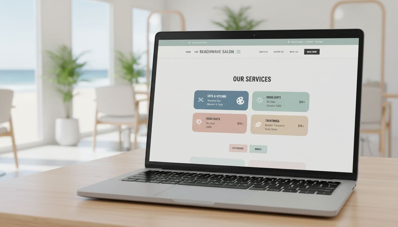
Your work is amazing. The blends are buttery. Your blowouts have bounce. But your hair salon website design service menu which acts as your digital storefront? It might be giving “I tried my best” energy.
If a new client lands on your site and sees 37 options, 12 “signature” things, and zero timing or pricing, they don’t book. They panic scroll, text a friend, and disappear into the void. It’s not personal. It’s brain science (and also, busy clients rely on a strong online presence).
The goal is simple: make it easy for a new client to pick the right service in under 30 seconds, then book in 1 to 2 taps on mobile. That’s the whole vibe. And yes, this is exactly how to organize hair salon services on your website without turning it into a novel.
Common pain points that slow bookings: Too many options, confusing names, no prices or timing, and the booking link playing hide-and-seek.
Start with a clear menu structure clients can scan fast
Think of your service menu like a good salon consultation with user-friendly navigation. You lead. You guide. You don’t throw 18 swatches at them and say, “So… pick a life path.”
A menu that books faster usually has:
- 4 to 6 main categories
- Popular services listed first
- Clear names (the words clients actually use)
- Short sections with mobile responsiveness that read well on a phone
Top-down matters. Start with what most people want, then get fancy. If someone is on mobile (they are), your menu has to incorporate responsive web design to work like a grocery list, not a treasure map.
Pick 4 to 6 categories that match how clients shop
Clients don’t think in brand lines, education levels, or “Tier 3 Stylist Experience Packages.” They think in needs.
Here are category sets that work for most salons, easily implemented in your website builder:
Simple category | What clients expect it includes:
Cuts and Styling | Haircuts, blowouts, and styling add-ons
Color | Root touch-ups, all-over color, and gloss/toner
Highlights and Balayage | Partial highlights, full highlights, balayage, and refresh appointments
Treatments | K18, deep conditioning, and scalp care
Extensions | Extension installs, move-ups, and consultations
Bridal and Event Hair | Updos, bridal styling, and trial runs
If you’re a multi-service salon (hair plus lashes, skin, brows), don’t force it into one mega list. Keep hair as its own clear section, then route to the other menus from there.
One add that helps a lot: a “New Guests” or “Not sure?” path. It’s basically a friendly on-ramp for people who don’t speak salon yet.
A simple version:
- New Guest Haircut
- New Guest Color (includes a quick consult)
- Not Sure, Help Me Choose (a consult booking option)
You’re not babying clients. You’re removing friction.
Lead with your top bookers, then tuck the niche services below
Inside each category, order services like this:
- Most booked (the bread and butter)
- More advanced options (big changes, corrections)
- Add-ons (toner, treatment, extra bowl, etc.)
Your menu doesn’t need to show every single variation up front. A tight main list keeps people moving.
A good target: 6 to 12 highlighted services total across the page (not per category). If you have more, use expand sections (accordion toggles) or separate pages for deep details. Long lists make people bounce, because it feels like homework.
Also, if you offer the same thing three ways with three different names, pick one. The client does not want to solve a riddle before they get blonde.
Write service descriptions that remove doubt and get the right booking
Your service menu isn’t the place for poetic writing. Save the romance for your about page. Here, clarity wins.
When service descriptions are vague, clients do one of two things:
- Book the wrong service, show up confused, and everyone loses.
- Don’t book at all and DM you at 9:47 pm, “How much is color??”
Keep service descriptions short, scannable, and around an 8th grade level. If your best friend wouldn’t understand the service name, change it.
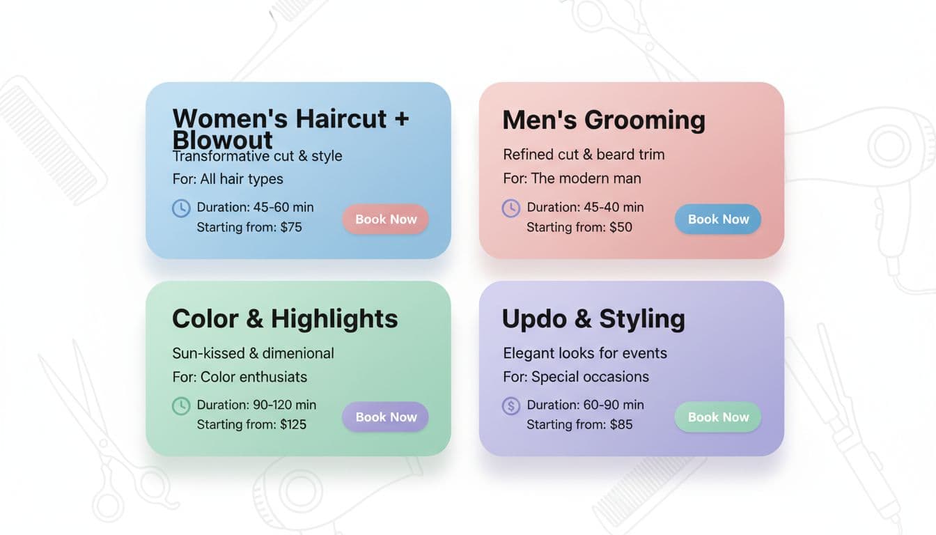
Use a simple service card formula: what it is, who it is for, time, and price
A “service card” is just the repeatable format for each service. The goal is self-selection, not a back-and-forth message thread.
Use this formula every time:
Service Name
1 to 2 lines on what it is
(Optional) “Best for…” line
Duration
Price (exact or “starting from”)
What makes the price change (quick, honest note)
Here’s what that looks like in real life:
Partial Highlight
Brightening around the face and crown, includes toner and blowout.
Best for: maintenance or a softer change.
Time: 2.5 to 3 hours
Price: Starting at $195
Price varies by hair length, thickness, and old color.
Root Touch Up
Covers new growth, includes gloss if needed and blowout.
Best for: gray coverage or consistent all-over color.
Time: 1.5 to 2 hours
Price: Starting at $125
Price varies by regrowth amount and color history.
If you need “starting from” pricing, use it. Just explain the variables like a normal person. This pricing transparency helps clients self-select:
- hair length and thickness
- how much product you’ll need
- past color (box dye, heavy buildup, dark-to-light)
For major changes (big blonding, corrective work, extension transformations), add a gentle guardrail: “Consult required for big changes.” That one sentence saves you hours.
Name services the way clients search, and avoid confusing menu labels
If your menu says “The Malibu” and “The Sunset,” your clients will smile politely and then pick neither.
Vague labels like Signature, Deluxe, or VIP don’t mean anything without context. They also make people worry they’ll choose wrong and look dumb. Nobody wants to feel dumb while paying money.
Better naming patterns are simple and literal:
- Women’s Haircut + Blowout
- Men’s Haircut
- Kids Cut (under 10)
- Root Touch Up
- All-Over Color
- Partial Highlight
- Full Highlight
- Balayage
- Balayage Refresh
- Gloss or Toner
Combo services can help booking speed because they match what people want in one click:
- Root Touch Up + Gloss
- Partial Highlight + Root Melt
- Haircut + Gloss
If your appointment scheduling software makes new clients pick between 10 color options, create a “New Guest Color” appointment. It can be priced a little higher to cover consult time, or it can include a built-in cushion. Either way, it protects your schedule and stops mis-bookings.
Also, keep names consistent between your website and your online booking system. If your site says “Balayage Refresh” but your online booking system says “Lived-In Lightening Maintenance Level 2,” it’s chaos. Cute chaos, but still chaos.
Make booking the easiest next step on every service

Your menu should not end with “Please contact us to book.” That’s not a menu, that’s a scavenger hunt.
Treat the service page like a booking tool, not just a price list. Especially on a Showit site, where you have full control of layout and buttons, you can make the path to booking ridiculously clear.
Put a Book button next to every service, not just at the top of the page
A single booking button at the top is fine until someone scrolls for 40 seconds and forgets where it went.
Put call-to-action buttons like a Book button (or Check Availability) next to each service card. Same color, same spot, every time. Consistency feels easy, and “easy” gets clicks.
Even better, link those call-to-action buttons straight to the correct service inside your booking widget, if your platform allows deep links. Less tapping, fewer wrong bookings.
A few practical Showit-friendly rules:
- Make buttons thumb-friendly on mobile (no tiny little chic buttons that hate hands).
- Keep your menu in HTML text, not an image or PDF. PDFs load slowly, don’t rank well, and make accessibility a mess.
- Keep spacing generous. Crowded menus feel stressful.
If your menu is currently a screenshot from Canva, it’s time. That file is not your employee. It’s not taking bookings.
Add trust signals near the menu so first-time clients feel safe choosing
New clients don’t just buy hair. They buy the feeling of, “This person won’t ruin my life.”
Add small trust-builders near the services, so they don’t have to go hunting:
Before and after photos: One great example near your hero services (blonding, extensions, transformations).
Client testimonials: One-line, short and specific, not a paragraph.
Clear policies: Cancellations, deposits, and late arrivals, plus contact information, linked near booking.
What to expect: A quick line like “Toner and blowout included” or “Includes styling.”
If your booking tool supports it, showing “next available” times can be a big push. People love instant answers.
If you have video, keep it quick. A 5 to 10 second clip of high-quality imagery for a lived-in blonde reveal can do more than three paragraphs of hype.
Test, refine, and keep your menu updated without starting over

Your menu isn’t a tattoo. You can change it. Please do.
Most salons set their menu once, then keep adding new services like it’s a junk drawer. Six months later, nobody knows what anything is, including you.
Small edits can raise bookings and improve search engine optimization without a full re-do. Think: reorder, rename, remove duplicates, tighten descriptions.
Use a quick monthly menu check: what to keep, cut, rename, or bundle
Once a month, set a 20-minute timer and do a quick cleanup to stay visible in local search results. No drama. No full website project. Just a tidy-up.
Checklist:
- Cut services you do rarely (if it’s once a quarter, it doesn’t need top billing).
- Merge overlapping options (three versions of “gloss” is too many).
- Confirm timing and pricing still match your salon management software.
- Update one photo near your top service.
- Check your “New Guest” options still match your local SEO strategy.
- Scan on your phone and see how fast it reads.
Seasonal services are where menus go off the rails. If you offer holiday styling, prom hair, or wedding trials, keep them clean:
- Add a seasonal category only when needed.
- Remove it when the season ends.
- Don’t leave “Prom Updo” sitting there in December like a forgotten decoration.
Common service menu mistakes that slow bookings (and quick fixes)
- Too many choices: Cut the list, highlight the top services.
- No duration listed: Add timing to every service, even add-ons.
- Pricing is vague: Use exact pricing or “starting from” with a clear reason.
- Booking button is buried: Put one next to every service.
- Long paragraphs: Break descriptions into 1 to 2 short lines.
- PDF menus: Replace with real web text, faster and easier to read.
- Unclear add-ons: Label what’s an add-on and what’s included.
- Names don’t match your booking system: Align labels so clients don’t get lost; sync with Google My Business for cross-platform consistency.
If you fix just two of these, bookings usually feel less sticky, setting up a clean digital workflow for automated appointment reminders.
Conclusion
A fast-booking service menu isn’t about having more services. It’s about user experience design that makes choices feel obvious. Keep categories simple, write clear service cards with time and price, and put booking buttons everywhere people might decide.
Pick one change you can do today: add durations, rename a confusing service, or move your top bookers to the top. Small tweaks to your appointment scheduling software can bring in real money, because fewer people bounce.
If you want this handled for you (with a Showit website builder that looks high-end through strong salon branding and books like it means it, complete with stylist bios, a portfolio gallery, social media integration, client testimonials, and clear contact information), a Website In A Day can clean up the confusion fast, boost your online presence and online booking system, so you spend less time answering DMs and more time doing hair.


My Website in a Day service is perfect for beauty pros who need a polished, professional online presence—like, yesterday. We’ll take one of my custom-designed Showit templates and tailor it to your brand, style, and services in just one day. You’ll walk away with a site that books clients, builds trust, and looks like a million bucks (without taking forever to launch).


