")


No-shows. Price shoppers. “Can you fix my box dye today?” messages at 10:47 pm. And the classic: a guest brings in an inspo pic that clearly took three stylists, two ring lights, and a small miracle.
If your bookings feel like a grab bag, you don’t need more people, you need the right people hitting “book.”
A new client page for your hair salon website is that one magical (but not actually magical, it’s salon marketing strategy) page that answers the big questions, sets expectations, and guides good-fit guests into your booking flow. The result is fewer awkward surprises, smoother consults, and guests who show up already understanding how you work.
This post gives you a simple page template plus a copy-and-paste checklist, so you can build a new client page that filters politely, not painfully, while strengthening your online presence.
Why Your New Client Page Attracts Better-Fit Guests (Not Just More Bookings)

A strong new client page isn’t “extra.” It’s the start of the guest experience, your pre-appointment conversation, written down once, so you don’t have to repeat it 43 times a week.
When you explain who you serve, how you price, and what results take time, people self-select. That means:
- fewer last-minute cancellations from guests who didn’t realize it’s a 3-hour appointment
- fewer unrealistic color expectations (hello, jet black to icy blonde in one visit)
- fewer “I only have $90” moments when your work starts at $275
- fewer bookings for services you don’t even offer (why are they like this)
Guests who discover your salon through local search land on this page, where it works quietly with your booking link and intake form. The page sets your brand personality, the intake form confirms details, and the online booking link is the final step. You’re pre-screening without sounding like a bouncer at a nightclub.
Signs you need a stronger new client page for your hair salon
If any of these are happening, your website design is being a little too “sure, whatever you want”:
- You get the same DMs over and over (pricing, timing, what to book).
- Guests reschedule constantly because they “didn’t know it would take that long.”
- People ignore your policies, then act shocked when you enforce them.
- Consults turn into an awkward “we’re not a match” talk.
- You keep getting requests for services you don’t offer.
- Guests are surprised by price, time, or maintenance.
Your new client page is where those misunderstandings go to die.
What “better-fit” actually means for a hair salon
“Better-fit” doesn’t mean “everyone has unlimited budget and never drinks coffee near white couches.” It means your guest is aligned with how you work.
Better-fit guests usually have:
- aligned expectations about what’s realistic in one visit
- the right budget range for your services
- a maintenance level that matches the look they want
- the correct service category (and they book it correctly)
- respect for your time and policies
A few quick examples:
- Extension-only salon: The page should say extensions aren’t same-day, require a consult, and have a real investment range. It filters out “I just want a few tracks for cheap.”
- Lived-in color specialist: The page should explain soft grow-out, long appointments, fewer visits per year, and the guest’s role (home care matters).
- Curly cutting: The page should set expectations around curl pattern, shrinkage, and styling education. It filters out “I want it flat-ironed and razor-thinned.”
What to Include on a New Client Page (The Exact Sections That Do the Work)
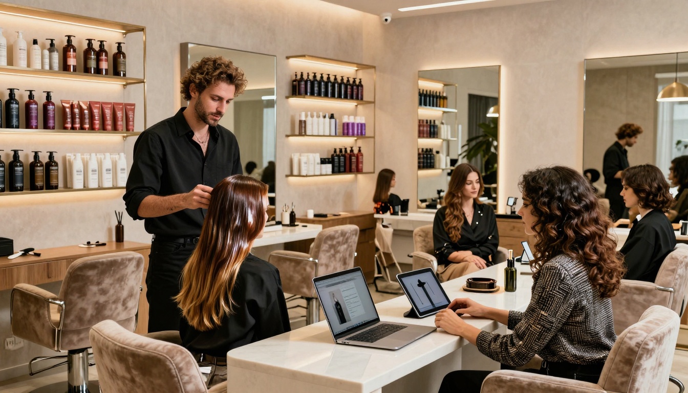
 Photo by cottonbro studio
Think of this page like a first date, but with better lighting and fewer red flags (hopefully). Invest in professional photography to create that high-quality first impression. You want warmth, clarity, and just enough structure to avoid chaos.
For each section below, you’ll get:
- what it is
- why it matters
- a quick “copy cue” you can borrow
A clear “Start Here” flow: who you serve, top services, and the next step
What it is: The top of the page (the first screen on mobile) should tell new guests exactly what to do.
Why it matters: Too many choices make people freeze. Confused people don’t book. They bounce, then DM you at midnight.
Copy cue: “New here? Start here. If you want [result you’re known for], you’re in the right place. Step 1: fill out the new guest form. Step 2: book your first visit.”
Keep it simple:
- short welcome
- who you’re best for
- client testimonials to build trust with new visitors
- your service menu with 3 to 6 core services in plain language, linked to the portfolio gallery
- one main call to action
Pricing information without a full price list (so you filter out sticker shock)
What it is: A pricing section that gives ranges, starting prices, or “most guests invest” language.
Why it matters: If your pricing is a mystery, you attract everyone. Including the people who want bargain-bin balayage. You’re not Walmart, babe.
Copy cue: “Most new color guests invest $250 to $450, depending on length, density, and hair history.”
A few helpful ways to share pricing without locking yourself into a rigid menu:
- Starting at: “Dimensional color starts at $___.”
- Ranges: “Extension installs range from $__ to $__.”
- Most guests invest: “Most first visits land between $__ and $__.”
Also, name the common add-ons so guests aren’t surprised:
- gloss/toner
- treatment
- haircut
- extra bowls (for long or dense hair)
Be direct about premium services:
- Extensions are a bigger investment.
- Color corrections cost more and take longer.
- Dark-to-blonde is often a multi-session plan, not a one-and-done miracle.
Time, maintenance, and expectations (the section that prevents disappointment)
What it is: A clear explanation of how long things take, what maintenance looks like, and what results are realistic.
Why it matters: Expectations are where trust is built, or broken. This section prevents the “wait… I thought I’d be platinum today” meltdown.
Copy cue: “Pinterest is welcome here. Hair history is in charge.”
Include:
- appointment length: “Plan for 2.5 to 4 hours for your first color visit.”
- maintenance level: “Most guests come in every 8 to 12 weeks.”
- home care: “Healthy hair needs salon-quality products and heat protection.”
- realistic results: “We’ll choose a goal that fits your hair’s current level and condition. Reference our before and after photos for style examples.”
Call out multi-session services with zero drama:
- corrective color
- dark box dye removal
- major lightening
- heavy banding or uneven tones
Let them know photos help, but they aren’t a contract. A photo is a direction, not a guarantee.
Policies and boundaries that protect your calendar (cancellation, late, deposits)
What it is: A short, friendly policy section with your non-negotiables.
Why it matters: Clear policies reduce cancellations and awkward conflicts. They also signal professionalism. People respect what you protect.
Copy cue: “A few studio notes so everything stays easy and fair.”
Include policy topics like:
- deposits (and if they’re non-refundable)
- cancellation window (24 or 48 hours)
- late arrivals (what happens at 10 minutes late, 15 minutes late)
- no-shows
- redo policy (time frame, what’s covered)
- kids or extra guests policy
- refunds (usually no refunds for services)
- communication rules (where to reach you, response times)
Quick placement tip: don’t lead with policies like a warning label. Put them after you’ve shown value, so it feels like a well-run business, not a threat.
The new client intake questions that qualify guests before you say yes
What it is: A short form that collects the info you need to avoid surprises.
Why it matters: A booking without context is how you end up double-booked with a color correction disguised as “partial highlight.” (been there, done that one!)
Recommended intake fields (keep it mobile-friendly, about 1 to 2 pages):
- name, email, phone
- emergency contact
- allergies and sensitivities (make this required)
- current hair history (box dye, henna, keratin, metals, prior lightening)
- inspiration photos upload
- hair goal in their words
- what they’ve loved or hated in the past
- maintenance comfort level (low, medium, high)
- budget range (optional, but helpful)
- consent plus e-signature for policies and chemical services
If you do extensions, add fields like:
- current hair density
- past extension experience
- lifestyle (gym, swimming, work schedule)
Template: Copy and Paste New Client Page for a Hair Salon (Simple, Friendly, High-Converting)
Use this structure exactly as-is, then swap in your details. Keep the tone warm, clear, and confident. This is a new client page, not a legal document. Tip: Prioritize mobile responsiveness so on-the-go guests can book seamlessly from their phones.
Done-for-you page layout (headline, sections, and suggested button text)
Hero section (first fold)
Headline: “New Here? Welcome to [Salon Name].”
Mini copy: “If you want [your signature result], you’re in the right chair. This page walks you through pricing, timing, and how to book your first visit.”
CTA button label: Fill Out the New Guest Form
Section: Who we’re best for
Copy: “We’re a great fit if you love [tone/style], you want hair health to stay a priority, and you’re open to a plan if your hair needs more than one visit.”
CTA button label: Start Here
Section: Services (3 to 6 only)
Service list copy (short and plain):
- “[Service 1]: for [simple outcome].”
- “[Service 2]: for [simple outcome].”
- “[Service 3]: for [simple outcome].”
CTA button label: Book Your First Visit
Section: New Client Special (optional)
Copy: “Enjoy our new client special with an introductory discount on your first service. Perfect for trying us out.”
CTA button label: Claim Your New Client Special
Section: Investment (pricing guidance)
Copy: “New guests typically invest $[low] to $[high] for color appointments. Extensions and corrections are quoted after a consult. Pricing depends on length, density, and hair history. We also offer gift cards as a supplementary option for new guests.”
CTA button label: See Starting Prices
Section: Timing + maintenance
Copy: “Plan for [X] to [Y] hours for your first visit. Most guests come back every [X] to [Y] weeks. We’ll talk through a plan that fits your schedule and budget, including retail sales recommendations for home care.”
CTA button label: Request a Consultation
Section: What to bring
Copy: “Bring 2 to 3 inspiration photos, plus an honest hair history (no judgment, just facts). If you’re not sure what was used on your hair, tell us that too.”
Section: A few studio notes (policies)
Copy: “We hold appointments with a $[amount] deposit. Cancellations within [24/48] hours forfeit the deposit. If you’re more than [X] minutes late, we may need to adjust or reschedule to keep the day on time. We send appointment reminders to help everyone stay on schedule.”
CTA button label: Read Studio Notes
Section: New guest form
Copy: “Step 1: Fill out the new guest form. This helps us match you with the right service and timing.”
CTA button label: Fill Out the New Guest Form
Section: Booking
Copy: “Step 2: Book your first visit. If you’re a big change, choose a consult so we can plan it right.”
CTA button label: Book Your First Visit
Section: FAQs
Add 6 to 10 FAQs max (the ones you’re tired of answering).
Final CTA
Copy: “Ready for hair that fits your life and your vibe? Let’s do this.”
CTA button label: Request an Appointment (booking button)
Short scripts you can steal (warm boundaries, price ranges, and “not a fit” wording)
Specialty script (say what you do, without sounding snobby)
“We specialize in [lived-in color / extensions / curls]. If that’s what you’re after, you’ll love it here.”
Deposit script (calm, clear, not apologizing)
“Your deposit holds your time and goes toward your service. Because we reserve that spot just for you, deposits are non-refundable.”
Transformation expectations (the reality check, nicely)
“Big changes are possible, but they don’t always happen in one visit. We’ll protect your hair and build a plan that gets you there safely.”
Price range script (filters out sticker shock fast)
“Most guests invest $__ to $__ for this service. If you’re hoping to stay under that, we can recommend a simpler option.”
Kind ‘not a fit’ wording (no drama, no shame)
“We may not be the best fit if:
- you need same-day bleach rescue
- you’re looking for the lowest price in town
- you can’t commit to the maintenance this look needs”
That last line matters. You’re not rejecting them as a human. You’re rejecting the mismatch.
Checklist: Before You Publish Your New Client Page
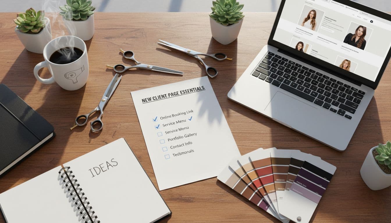
This is the part where you catch the little stuff that causes big confusion.
Quality check for better-fit bookings and optimal user experience (clarity, trust, and fewer questions)
- The page answers your top 10 new guest questions.
- It’s clear who you serve (and who you don’t).
- The next step is obvious within 5 seconds.
- Pricing guidance is included (range, starting price, or “most invest”).
- Maintenance expectations are stated.
- Policies are visible and written in plain language.
- Links to your social media profiles connect to other salon platforms.
- Your Google Business Profile links directly to this new client page.
- The intake form integrates with your salon software and is required before booking (or clearly linked).
- Photo upload is available for color and correction services.
- Confirmation message sets expectations (timing, prep, deposit rules) and supports email marketing for follow-up communication.
- The tone feels friendly, not strict.
After launch, pay attention to what people still ask. Add those questions to your FAQs and tighten your wording.
Conclusion

A strong new client page for hair salon websites does more than look pretty. It saves your time, protects your calendar, and attracts website visitors who convert into loyal guests that respect your work and your policies.
Start with the template, publish it, promote through social media and influencer marketing to drive traffic from your community, then adjust based on the questions you still get in real life. Your page should get smarter every month, kind of like you did after surviving your first “at-home bleach” client. From there, introduce a loyalty program to reward those better-fit clients.
If you want the fastest path to a strategic new client page (and a full Showit site with professional website design that finally matches your talent), Website In A Day is the move. One day, clear messaging, clean design, and a booking flow that brings in better-fit guests without you babysitting your inbox.


My Website in a Day service is perfect for beauty pros who need a polished, professional online presence—like, yesterday. We’ll take one of my custom-designed Showit templates and tailor it to your brand, style, and services in just one day. You’ll walk away with a site that books clients, builds trust, and looks like a million bucks (without taking forever to launch).


