")


A dream client lands on your salon site while they’re waiting in the Target drive-up line. You’ve got seconds. Not minutes. Seconds.
Your hair salon website homepage, your digital storefront, isn’t just there to look pretty (although yes, we love a pretty homepage). It has one job: answer the big questions fast, build trust, and guide people to book without sending you a “Hey girly, how much for highlights?” DM at 11:47 pm.
This hair salon homepage checklist is the key to effective salon website design for busy beauty business owners who want more bookings, better-fit clients, and fewer back-and-forth messages. It works for full salons, suites, and independent stylists, because clients all shop the same way: quickly, on their phones, with strong opinions.
First impressions that make clients stay (and click Book Now)
1) A hero section that says who you help, what you do, and where you are
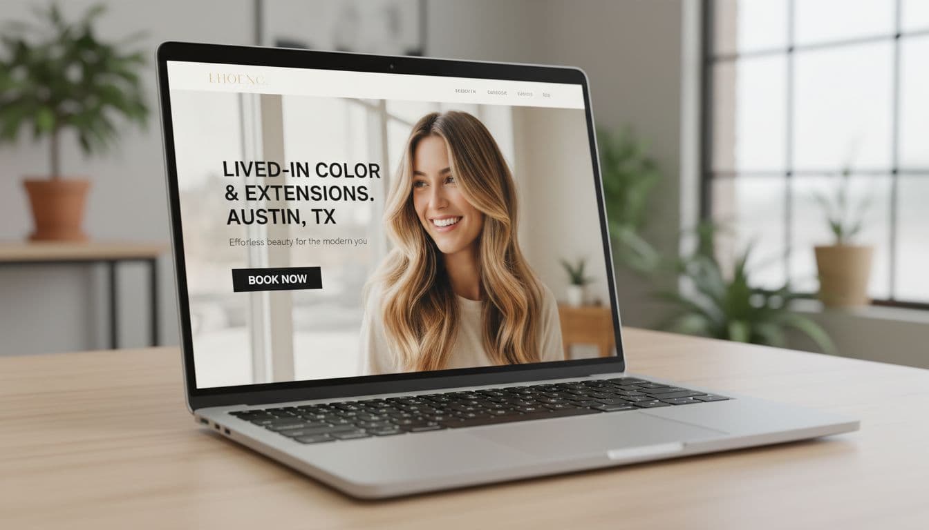
Your hero section (the top part people see first) should deliver a clear call to action with user-friendly design that makes it obvious you’re the answer to their problem. Think: outcome + service + location. Feature high-quality images to showcase your work.
A strong headline looks like: “Lived-in color and extensions in Austin.” Then add one short line to support it, like what your vibe is (low-maintenance blondes, luxury hair, curly-safe cuts), and who you love working with.
Skip vague slogans like “Be your best self” unless you want clients to scroll away and book with someone who actually tells them what they do. Also skip busy collages and tiny text. If they need to pinch-zoom, you already lost them.
2) A bold, always-easy-to-find Book Now button
Clients want to book the way they order iced coffee: fast, no confusion, minimal thinking with your online booking system.
Give them one main call to action, usually Book Now, in a high-contrast button. Put it in the hero section, then repeat it throughout the page. On mobile, a sticky header or sticky button can help, as long as it doesn’t cover half the screen like an overprotective screen protector.
Also, booking should open in one tap. If it launches a maze of tabs and mystery logins, people bail.
3) A clean menu that answers the big questions fast
Your navigation menu should feel like a calm front desk, not a junk drawer.
Keep labels clear and normal. Clients understand:
- Services
- Pricing
- About Us page
- Gallery
- Book
- Contact
Use “Pricing” instead of a cute name like “Investment” if your audience is mostly new clients. Cute is fine, confused isn’t. Too many dropdowns and pages can lose people fast, especially on phones.
4) Fast load speed and mobile-first layout
If your homepage loads slow, clients assume your availability is also “kinda chaotic,” even if you’re actually organized. Harsh, but true.
Optimize page load times to about 3 seconds on mobile with strong mobile responsiveness. People notice when images jump around, buttons are tiny, and text is hard to read.
Quick fixes that actually help:
- Compress big images before uploading
- Skip autoplay video (or keep it lightweight)
- Use readable font sizes
- Make forms easy to tap with a thumb
5) Brand look and readability that feels high-end and calm
A pro website signals a pro service. Your homepage should reflect your salon branding: intentional, clean, and easy to move through.
Stick to consistent colors, 2 to 3 fonts, strong contrast, and enough white space so your content can breathe. Clear headings and spacing matter more than fancy design tricks.
Accessibility basics are not “extra,” they’re normal:
- Text that’s easy to read
- Buttons that look like buttons
- Contrast that doesn’t require perfect eyesight and a prayer
The 15-point hair salon homepage checklist clients use to decide if they trust you
You’ve handled the first impression. Now you need the stuff clients hunt for when they’re deciding if you’re “the one” or just “someone with cute Instagram.”
6) Clear services snapshot, with starting prices or price ranges
Put a short list of your top services right on the homepage. Think cuts, color, balayage, extensions, treatments, styling.
Add “starts at” pricing or ranges. Yes, even if you hate talking numbers. Pricing transparency doesn’t scare away good clients, it filters out the wrong-fit ones and saves you from awkward sticker-shock moments.
If you have a full service menu page, link to it from the snapshot, but don’t make people hunt.
7) A signature offer or specialty that makes you the obvious choice
Dream clients don’t want “a hairstylist.” They want someone great at what they need.
Pick 1 to 3 specialties and make them loud and clear on your landing page, like:
- Lived-in blondes for busy professionals
- Curly cuts for defined, frizz-controlled curls
- Extensions for fine hair that needs fullness
Include who it’s for and the result they can expect. This is the part that makes someone think, “Okay, this is my person.”
8) A simple “How to book” section that removes friction
People hesitate when they’re not sure what happens next. Fix that with a short booking section that explains the process.
Keep it friendly and simple, like your online booking system:
- Choose your service
- Pick your stylist (if needed)
- Pick a day and time
- Pay a deposit (if required)
Add brief notes on key policies (deposit, cancellation window), and keep the tone human. Save the full policy wall of text for a separate page.
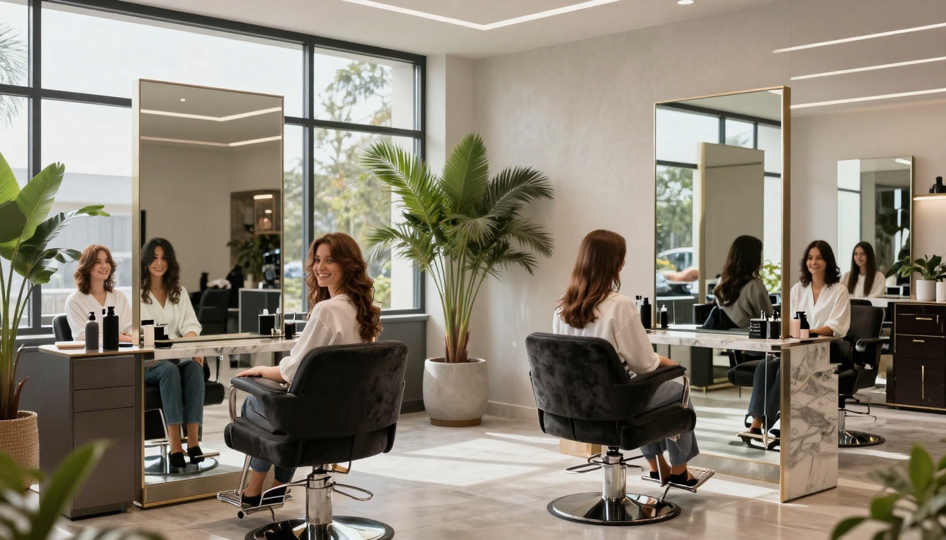
9) Real photos that prove your results (not generic stock images)

Stock photos are the website version of catfishing. Clients can tell.
Add a curated portfolio gallery with your best work. Keep lighting consistent in these high-quality images, show close-ups, and use before and after photos when it helps show skill (especially for corrective color and extensions).
If you serve diverse hair types and textures, show that clearly in your portfolio gallery. Clients look for someone who has done hair like theirs before. Also, update the gallery regularly with high-quality images so your site doesn’t feel abandoned.
10) Social proof: reviews, testimonials, and quick credibility signals
Clients don’t trust you because you said you’re amazing. They trust you because other people said it.
Feature a handful of strong testimonials and client reviews, ideally with first name and last initial. Bonus points if the testimonial mentions the service, like “balayage” or “curly cut,” because it helps new clients picture their own appointment.
Other trust signals (use what’s real for you):
- Years behind the chair
- Education and certifications
- Awards or local features
- Brand partnerships (only if they’re legit and relevant)
11) Meet the stylist or team, with photos that feel like you
People book people. A clean team section builds comfort fast.
Include friendly headshots and short stylist bios. Add what each stylist is best for, so clients self-select. This cuts down on “Who should I book with?” messages.
If you offer comfort details that matter to dream clients, say so:
- Quiet appointments
- Gender-affirming cuts
- Curly hair experience
- Sensory-friendly options
It’s not “too much info,” it’s how people decide they’ll feel safe in your chair.
12) Location, hours, and contact info that is impossible to miss
Clients shouldn’t have to go on a scavenger hunt to find your address. Put contact information in an obvious spot, and repeat it in the footer too.
Include:
- Address (or service area if you travel)
- Hours
- Parking notes (seriously, people care)
- Tap-to-call phone number on mobile
A map embed from Google My Business can help, but only if it doesn’t slow your site. Also add a clear “New clients start here” contact option for questions that aren’t booking-related.
13) New client info that sets expectations and prevents awkward surprises
This is where you stop problems before they happen.
Keep it short and calm:
- When to arrive
- What to come with (clean, dry, detangled, whatever you prefer)
- Late policy (in plain language)
- Child and guest policy
- What to do if they’re unsure what to book
You’re not being strict. You’re being clear, and clear feels professional.
14) A consult option for high-ticket services
Extensions and big color changes need more than a “So… I want to be blonde” note.
Offer a quick consult option, like:
- A short form with hair history
- Photo upload
- Mini consult call or in-person consult
Consults protect your time, set budget expectations, and help you deliver better results. Busy clients love knowing what it’ll cost, how long it’ll take, and what upkeep looks like before they commit.
15) An email list freebie or perk that keeps you top of mind
Not everyone is ready to book today. Some are just lurking, comparing, and pretending they’re “just looking.”
Give them a simple reason to stay connected for lead generation:
- A hair care routine checklist
- First-time client tips
- Early access to cancellations
- New client promotions
This turns “maybe later” into “booked next week” through e-newsletters, without you chasing anyone.
Make it convert: quick homepage layout that turns visits into appointments
You can have every single checklist item, but order still matters. Clients scroll in a predictable pattern, and your homepage should answer questions in the same order they’re thinking them.
A simple homepage flow you can follow
Here’s a clean structure that works for most hair salon websites. This order aids search engine optimization and local SEO by helping search engines better understand the site:
- Hero with clear headline + Book Now
- Service menu snapshot + starting prices
- Specialty or signature offer
- Proof (gallery)
- Reviews
- Team or stylist intro
- New client info
- How to book + key policies
- Location, hours, contact
- Final Book Now call to action
Not every salon needs every block, but this order keeps the page scannable and booking-focused.
Common homepage mistakes that quietly lose dream clients
These issues don’t feel “huge,” but they cost you appointments on your hair salon website:
- No prices anywhere
- Booking button is hard to find
- Too much text, not enough structure
- Outdated photos (or none)
- Too many calls to action
- Poor page load times
- Confusing service names
- Missing location info
- Policies written in a harsh, scolding tone
- Lacking user-friendly design
Most of these are easy fixes with a website builder like Wix or Squarespace, and they make you look more premium overnight.
Conclusion
Your hair salon website homepage should do three jobs: build trust through strong salon branding, show results, and make booking easy. If one of those is missing, clients feel it, even if they can’t explain why.
Pick three fixes to do this week for your hair salon website, then work through the rest of this hair salon homepage checklist when you’ve got time (or caffeine). These changes will also improve your search engine optimization for long-term client attraction. If you want it done fast, with a homepage that attracts the right clients and saves you from endless DMs, a Website In A Day build provides a clear call to action to get you there without dragging it out for months. Your future self, and your inbox, will thank you.


My Website in a Day service is perfect for beauty pros who need a polished, professional online presence—like, yesterday. We’ll take one of my custom-designed Showit templates and tailor it to your brand, style, and services in just one day. You’ll walk away with a site that books clients, builds trust, and looks like a million bucks (without taking forever to launch).


